:root{ --navy:#092d4c;--blue:#1777ad;--red:#d94b43;--green:#368c49;--yellow:#dda91f; --ink:#132b3e;--muted:#647482;--line:#d9e2e7;--paper:#fff;--wash:#f5f8fa; } *{box-sizing:border-box}html{scroll-behavior:smooth} body{margin:0;font-family:Arial,Helvetica,sans-serif;color:var(--ink);background:#fff;line-height:1.55} a{text-decoration:none;color:inherit}img{max-width:100%;display:block} .wrap{width:min(1160px,calc(100% - 48px));margin:auto} .preview{background:#092d4c;color:#fff;text-align:center;padding:9px 16px;font-size:12px;font-weight:700} .preview span{opacity:.7;font-weight:400} .kicker,.eyebrow{display:block;font-size:11px;font-weight:800;letter-spacing:.14em;text-transform:uppercase;color:var(--blue);margin-bottom:12px} h1,h2,h3,p{margin-top:0} h1{font-family:Georgia,"Times New Roman",serif;font-size:clamp(45px,5.6vw,72px);line-height:.98;letter-spacing:-.035em;color:var(--navy);font-weight:700;margin-bottom:24px} h1 span{display:block;color:var(--blue)} h2{font-family:Georgia,"Times New Roman",serif;font-size:clamp(31px,3.6vw,48px);line-height:1.04;letter-spacing:-.025em;color:var(--navy);font-weight:700;margin-bottom:15px} h3{font-size:19px;line-height:1.2;color:var(--navy);margin-bottom:9px} p{color:var(--muted)} .section-head{max-width:760px;margin:0 0 38px;text-align:left} .section-head p{font-size:16px;max-width:680px} .btn{display:inline-flex;align-items:center;justify-content:center;padding:13px 19px;font-size:14px;font-weight:800;border:1px solid transparent;transition:.18s} .btn:hover{transform:translateY(-1px)} .btn-blue{background:var(--blue);color:#fff}.btn-dark{background:var(--navy);color:#fff} .btn-outline{background:#fff;border-color:#9bb0bd;color:var(--navy)} .btn-apply{background:var(--red);color:#fff;border-color:var(--red)} .actions{display:flex;gap:10px;flex-wrap:wrap} /* 1 HERO — editorial split, no floating rounded card */ .hero{padding:74px 0 54px;background:#f3f8fb;border-bottom:1px solid var(--line)} .hero-grid{display:grid;grid-template-columns:.92fr 1.08fr;gap:46px;align-items:center} .hero-lead{font-size:18px;max-width:620px;margin-bottom:25px} .guide-link{display:inline-block;margin-top:15px;font-size:12px;font-weight:700;color:#526c7c;border-bottom:1px solid #b8c7cf;padding-bottom:2px} .pricing{font-size:12px;color:#7b8993;margin-top:12px} .hero-product{display:block;background:#fff;border-left:5px solid var(--red)} .hero-image{position:relative;min-height:455px;padding:10px 16px;display:flex;align-items:center;justify-content:center} .hero-image img{max-height:445px;max-width:96%;object-fit:contain}.hero-image.hero-retail{padding:0;overflow:hidden;background:#e8eef1}.hero-image.hero-retail img{width:100%;height:455px;max-width:none;max-height:none;object-fit:cover;object-position:center center} .badge{position:absolute;top:18px;left:18px;background:var(--navy);color:#fff;padding:7px 10px;font-size:10px;font-weight:800;letter-spacing:.08em} .hero-bar{background:#fff;border-top:1px solid var(--line);padding:18px 20px;display:grid;grid-template-columns:1fr auto;align-items:center;gap:18px;color:var(--navy)} .hero-bar small{display:block;font-size:10px;letter-spacing:.1em;color:#657681}.hero-bar strong{font-size:16px}.hero-bar a{align-self:center;white-space:nowrap;font-weight:800;color:var(--blue);border-bottom:1px solid #8fc3dd} .trust{display:grid;grid-template-columns:repeat(5,1fr);margin-top:32px;border-top:1px solid #cbd9e1;border-bottom:1px solid #cbd9e1} .trust div{padding:14px 9px;text-align:center;border-right:1px solid #cbd9e1}.trust div:last-child{border-right:0} .trust strong{display:block;font-size:19px;color:var(--navy)}.trust span{font-size:11px;color:#687985} .trust div:nth-child(1) strong{color:var(--red)}.trust div:nth-child(3) strong{color:var(--blue)}.trust div:nth-child(4) strong{color:var(--green)}.trust div:nth-child(5) strong{color:var(--yellow)} /* 2 PROGRAMS — flat catalog rows/cards */ .programs{padding:72px 0 78px;background:#fff}.programs .section-head{max-width:820px;margin:0 auto 42px;text-align:center}.programs .section-head p{margin-left:auto;margin-right:auto} .program-grid{display:grid;grid-template-columns:repeat(3,1fr);gap:0;border-top:1px solid var(--line);border-bottom:1px solid var(--line)} .card{display:block;padding:0 25px 28px;border-right:1px solid var(--line);background:#fff}.card:first-child{padding-left:0}.card:last-child{border-right:0;padding-right:0} .card-img{height:290px;display:flex;align-items:center;justify-content:center;padding:8px;position:relative;background:#f7f8f8;margin-bottom:20px} .card-img img{width:100%;height:100%;object-fit:contain;transform:scale(1.06)}.card-copy{padding:0} .card-copy p{font-size:14px;min-height:66px}.tags{display:none}.more{font-size:13px;font-weight:800;color:var(--blue);border-bottom:1px solid #9bc7df} /* 3 CORE — large photography and simple numbered process */ .core{padding:78px 0;background:#eef5f8} .core-grid{display:grid;grid-template-columns:.72fr 1.28fr;gap:42px;align-items:center} .core-copy>p{font-size:17px}.core-image{background:#fff}.core-image img{width:100%;height:500px;object-fit:cover} .core-visuals{display:grid;grid-template-columns:1.08fr .92fr;gap:14px;align-items:stretch} .core-visuals figure{margin:0;background:#fff;border:1px solid #d9e2e7} .lifestyle-figure img{width:100%;height:430px;object-fit:cover;object-position:center} .howto-figure{display:flex;flex-direction:column} .howto-figure img{width:100%;height:430px;object-fit:contain;background:#fff;padding:8px} .core-visuals figcaption{padding:13px 15px;font-size:12px;line-height:1.45;color:#5a6e7c;border-top:1px solid #e2e8eb} .core-visuals figcaption strong{color:#092d4c;font-size:13px} .steps{margin:27px 0;border-top:1px solid #bfcfd8} .step{display:grid;grid-template-columns:44px 1fr;align-items:center;padding:12px 0;border-bottom:1px solid #bfcfd8} .step b{font-size:12px;color:var(--red)}.step strong{font-size:13px;color:var(--navy)} .pills{display:flex;gap:16px;flex-wrap:wrap}.pills span{font-size:11px;font-weight:800;color:#3d5869} /* 4 FAMILIES — product catalog, square photography */ .families{padding:78px 0} .family-grid{display:grid;grid-template-columns:repeat(4,1fr);gap:24px} .family{display:block;border-top:4px solid var(--blue);padding-top:0} .family:nth-child(1){border-image:linear-gradient(90deg,var(--red),var(--blue),var(--green),var(--yellow)) 1} .family:nth-child(2){border-color:var(--green)}.family:nth-child(3){border-color:var(--blue)}.family:nth-child(4){border-color:var(--red)} .family-img{height:250px;background:#f5f6f6;margin-bottom:16px}.family-img img{width:100%;height:100%;object-fit:contain} .family-copy{padding:0}.family-copy p{font-size:13px;min-height:52px}.family-copy strong{font-size:12px;color:var(--blue);border-bottom:1px solid #9bc7df} /* 5 STORES — simple directory, less icon-card UI */ .stores{padding:76px 0;background:#f7f8f8;border-top:1px solid #e5eaed;border-bottom:1px solid #e5eaed} .store-layout{display:grid;grid-template-columns:1fr 280px;gap:38px} .store-grid{display:grid;grid-template-columns:repeat(2,1fr);border-top:1px solid var(--line)} .store{padding:18px 20px 18px 0;border-bottom:1px solid var(--line);min-height:112px} .store:nth-child(odd){border-right:1px solid var(--line)}.store:nth-child(even){padding-left:20px} .store-icon{font-size:23px;margin-bottom:7px}.store h3{font-size:16px}.store p{font-size:12px;margin:0} .guide-box{background:var(--navy);color:#fff;padding:30px 26px;display:flex;flex-direction:column;justify-content:center} .guide-box h3{color:#fff;font-family:Georgia,"Times New Roman",serif;font-size:25px}.guide-box p{color:#d1dde5;font-size:13px}.guide-box .pin{font-size:30px;margin-bottom:10px} /* 6 WHY — strong business strip, flatter benefit columns */ .why{padding:72px 0;background:#135a87;color:#fff} .why .section-head{margin-bottom:30px}.why .kicker{color:#d6efff}.why h2{color:#fff}.why .section-head p{color:#e2edf4} .why-grid{display:grid;grid-template-columns:repeat(4,1fr);border-top:1px solid rgba(255,255,255,.35)} .why-card{padding:27px 25px 10px 0;border-right:1px solid rgba(255,255,255,.28);min-height:210px} .why-card+ .why-card{padding-left:25px}.why-card:last-child{border-right:0} .why-big{font-family:Georgia,"Times New Roman",serif;font-size:49px;font-weight:700;line-height:1;color:#fff;margin-bottom:13px} .why-label{font-size:10px;font-weight:800;letter-spacing:.13em;color:#cfe8f7;margin-bottom:8px} .why-card h3{color:#fff;font-size:18px}.why-card p{color:#dce9f1;font-size:13px;margin-bottom:0} .why-symbol{width:38px;height:38px;display:flex;align-items:center;justify-content:center;font-size:23px;font-weight:800;margin-bottom:15px;color:#fff} .margin .why-big{color:#ffdad6}.demand .why-symbol{color:#cfefff}.wellness .why-symbol{color:#c9efcf}.nrt .why-symbol{color:#ffd0cc} /* 7 ACCOUNT — keep popup URLs/classes from approved V7 */ .partner{padding:76px 0;background:#fff} .partner-card{border-top:5px solid var(--navy);border-bottom:1px solid var(--line)} .partner-top{display:grid;grid-template-columns:.95fr 1.05fr;gap:50px;padding:38px 0} .partner-copy{padding:0}.partner-copy h2{font-size:clamp(35px,3.5vw,49px)}.partner-copy h2 .pricing-pop{color:var(--red)}.partner-copy p{font-size:15px} .benefits{display:grid;grid-template-columns:1fr 1fr;gap:10px;margin-top:20px}.benefits span{font-size:12px;font-weight:700;color:#435f70} .access{display:grid;grid-template-columns:1fr 1fr;border:1px solid var(--line)} .access-box{padding:28px;display:flex;flex-direction:column;min-height:255px;background:#fff} .access-box:first-child{border-right:1px solid var(--line);border-top:4px solid var(--red)} .access-box:last-child{border-top:4px solid var(--navy)} .access-box small{font-size:10px;font-weight:800;letter-spacing:.09em;color:#6a7d89}.access-box h3{font-size:20px;margin-top:10px} .access-box:first-child h3{color:var(--red)}.access-box p{font-size:12px;margin-bottom:18px}.access-box .btn{margin-top:auto;width:100%} .contact{border-top:1px solid var(--line);padding:16px 0;display:flex;gap:28px;flex-wrap:wrap;font-size:12px;font-weight:700;color:#365469} @media(max-width:900px){ .hero-grid,.core-grid,.partner-top{grid-template-columns:1fr}.core-visuals{grid-template-columns:1fr 1fr}.program-grid{grid-template-columns:1fr 1fr}.card:nth-child(2){border-right:0}.card:nth-child(3){margin-top:30px} .family-grid{grid-template-columns:1fr 1fr}.store-layout{grid-template-columns:1fr}.why-grid{grid-template-columns:1fr 1fr}.why-card:nth-child(2){border-right:0} } @media(max-width:620px){ .wrap{width:min(100% - 28px,1160px)}.hero,.programs,.core,.families,.stores,.why,.partner{padding:50px 0} h1{font-size:43px}h2{font-size:32px}.actions .btn{width:100%}.trust{grid-template-columns:repeat(2,1fr)}.trust div{border-bottom:1px solid #cbd9e1}.trust div:last-child{grid-column:1/-1} .program-grid,.family-grid,.store-grid,.why-grid,.access{grid-template-columns:1fr}.card,.card:first-child,.card:last-child{padding:0 0 26px;border-right:0}.card+ .card{margin-top:28px} .core-image img{height:auto}.core-visuals{grid-template-columns:1fr}.lifestyle-figure img,.howto-figure img{height:auto;max-height:none}.hero-image{min-height:360px}.hero-image img{max-height:350px}.hero-image.hero-retail img{height:360px;max-height:none}.card-img{height:250px}.store:nth-child(odd){border-right:0}.store:nth-child(even){padding-left:0}.why-card,.why-card+ .why-card{padding:22px 0;border-right:0;border-bottom:1px solid rgba(255,255,255,.25)} .partner-top{gap:25px}.access-box:first-child{border-right:0;border-bottom:1px solid var(--line)}.benefits{grid-template-columns:1fr} } .hero-image.hero-retail{padding:0;background:#fff;overflow:hidden;display:flex;align-items:center;justify-content:center} .hero-image.hero-retail img{width:100%;height:auto;max-width:100%;max-height:none;object-fit:contain;object-position:center} .product-story{padding:68px 0 74px;background:#fff} .product-story .story-head{max-width:760px;margin:0 auto 30px;text-align:center} .product-story .eyebrow{font-size:10px;font-weight:800;letter-spacing:.15em;color:#0b7fa3} .product-story h2{font-family:Georgia,'Times New Roman',serif;font-size:38px;line-height:1.08;color:#092d4c;margin:10px 0 10px} .product-story p{font-size:14px;color:#5a6e7c;margin:0} .story-visual{max-width:1040px;margin:0 auto;background:#fff} .story-visual img{display:block;width:100%;height:auto;object-fit:contain} @media(max-width:760px){.product-story{padding:48px 0}.product-story h2{font-size:30px}} /* V8.5 compact product-story override */ .product-story{padding:62px 0;background:#fff} .product-story .story-row{display:grid;grid-template-columns:.72fr 1.28fr;gap:46px;align-items:center;max-width:1100px;margin:0 auto} .product-story .story-copy{text-align:left} .product-story .story-copy .eyebrow{font-size:10px;font-weight:800;letter-spacing:.15em;color:#0b7fa3} .product-story .story-copy h2{font-family:Georgia,'Times New Roman',serif;font-size:38px;line-height:1.08;color:#092d4c;margin:10px 0 14px} .product-story .story-copy p{font-size:14px;line-height:1.65;color:#5a6e7c;margin:0 0 20px} .product-story .story-points{display:flex;flex-wrap:wrap;gap:8px 16px;padding-top:15px;border-top:1px solid #d7e1e6} .product-story .story-points span{font-size:11px;font-weight:800;color:#173b55} .product-story .story-visual{max-width:none;margin:0;background:#fff;display:flex;align-items:center;justify-content:center} .product-story .story-visual img{display:block;width:100%;height:410px;object-fit:contain} @media(max-width:900px){ .product-story .story-row{grid-template-columns:1fr;gap:25px} .product-story .story-copy{text-align:center} .product-story .story-points{justify-content:center} .product-story .story-visual img{height:auto;max-height:520px} } /* V8.6 — fuller desktop editorial layout */ @media(min-width:1100px){ .wrap{max-width:1280px} .hero .wrap{max-width:1280px} .hero-grid{grid-template-columns:.88fr 1.12fr;gap:54px} .hero-copy h1{font-size:64px;line-height:.95} .hero-copy>p{font-size:17px;line-height:1.55;max-width:590px} .hero-image.hero-retail img{width:100%;max-height:560px;object-fit:contain} .programs .wrap,.core .wrap,.families .wrap,.stores .wrap,.why .wrap,.partner .wrap{max-width:1280px} .program-grid{gap:0} .program-card img{width:100%} .core-grid{grid-template-columns:.76fr 1.24fr;gap:52px} .core-copy h2{font-size:48px} .core-copy>p{font-size:16px;line-height:1.55} .core-visuals{grid-template-columns:1.08fr .92fr;gap:18px} .product-story .story-row{max-width:1280px;grid-template-columns:.82fr 1.18fr;gap:58px} .product-story .story-copy h2{font-size:46px} .product-story .story-copy p{font-size:16px;max-width:520px} .product-story .story-visual img{height:500px} .families-grid,.store-grid{width:100%} .why-grid{width:100%} .partner-grid{width:100%} } @media(min-width:1450px){ .wrap,.hero .wrap,.programs .wrap,.core .wrap,.families .wrap,.stores .wrap,.why .wrap,.partner .wrap{max-width:1320px} } /* ================= V9 FINAL REFINEMENTS ================= */ .product-story{padding:68px 0;background:#fff} .product-story .story-three{ display:grid; grid-template-columns:1fr .82fr 1fr; gap:34px; align-items:center; max-width:1320px; margin:0 auto } .product-story .story-side{ min-width:0; display:flex; align-items:center; justify-content:center } .product-story .story-side img{ display:block; width:100%; height:430px; object-fit:contain; background:#fff } .product-story .story-center{text-align:center;padding:0 8px} .product-story .story-center .eyebrow{ font-size:10px;font-weight:800;letter-spacing:.15em;color:#0b7fa3 } .product-story .story-center h2{ font-family:Georgia,'Times New Roman',serif; color:#092d4c;font-size:42px;line-height:1.03;margin:10px 0 16px } .product-story .story-center p{ font-size:14px;line-height:1.65;color:#5a6e7c;margin:0 auto 22px;max-width:390px } .product-story .story-points{ display:grid;grid-template-columns:1fr 1fr;gap:0 16px; border-top:1px solid #d7e1e6 } .product-story .story-points span{ font-size:11px;font-weight:800;color:#173b55; padding:10px 0;border-bottom:1px solid #d7e1e6 } /* Keep V8.6's imagery-rich sections intact and give images room to read */ @media(min-width:1100px){ .programs .card-img{height:260px} .programs .card-img img{max-height:245px} .core-visuals{grid-template-columns:1.08fr .92fr} .core-visuals figure img{min-height:390px} .family-img{height:245px} .family-img img{max-height:230px} } @media(max-width:1000px){ .product-story .story-three{grid-template-columns:1fr 1fr} .product-story .story-center{grid-column:1 / -1;grid-row:1} .product-story .story-left{grid-column:1;grid-row:2} .product-story .story-right{grid-column:2;grid-row:2} .product-story .story-side img{height:390px} } @media(max-width:650px){ .product-story .story-three{grid-template-columns:1fr} .product-story .story-center,.product-story .story-left,.product-story .story-right{grid-column:1;grid-row:auto} .product-story .story-side img{height:auto;max-height:470px} } /* ========================================================= CIGTRUS V9 FINAL WIDE — GLOBAL LAYOUT ONLY Approved V9.1 design, widened for desktop. ========================================================= */ @media (min-width:1201px){ .wrap, .hero .wrap, .programs .wrap, .core .wrap, .families .wrap, .stores .wrap, .why .wrap, .partner .wrap{ width:calc(100% - 64px)!important; max-width:1460px!important; padding-left:0!important; padding-right:0!important; } .product-story .story-row{ width:calc(100% - 64px)!important; max-width:1460px!important; } } /* Remove unintended hero divider/accent line after widening. */ @media (min-width:901px){ .hero-copy, .hero-copy:before, .hero-copy:after, .hero-grid > div:first-child{ border-left:0!important; border-right:0!important; } .hero-copy:before, .hero-copy:after{content:none!important} } /* Preserve comfortable tablet/mobile gutters. */ @media (max-width:1200px){ .wrap, .hero .wrap, .programs .wrap, .core .wrap, .families .wrap, .stores .wrap, .why .wrap, .partner .wrap{width:calc(100% - 40px)!important} } @media (max-width:650px){ .wrap, .hero .wrap, .programs .wrap, .core .wrap, .families .wrap, .stores .wrap, .why .wrap, .partner .wrap{width:calc(100% - 30px)!important} } /* FINAL CLEANUP — HERO Remove red divider and let the retail image sit naturally in the hero. */ .hero-product{ border-left:0!important; background:transparent!important; } .hero-image.hero-retail{ background:transparent!important; padding:0!important; } .hero-image.hero-retail img{ width:100%!important; height:auto!important; max-width:100%!important; max-height:none!important; object-fit:contain!important; }
CIGTRUS WHOLESALE

Nicotine-Free Products Built for Modern Retail

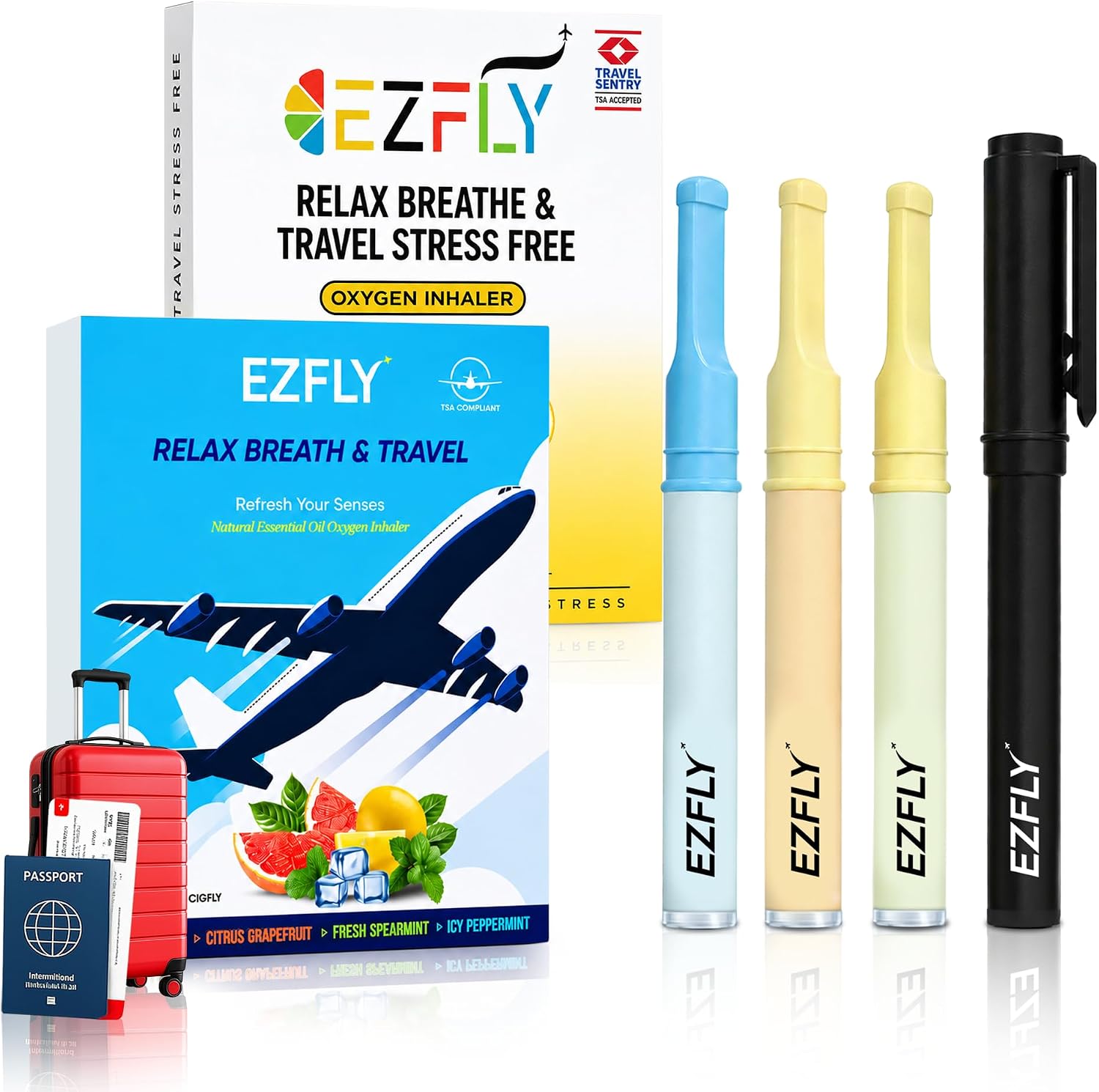
Cigtrus offers retailers a simple nicotine-free product line designed for countertop, shelf and pegboard placement across convenience, pharmacy, wellness, travel and specialty retail.

Not sure where Cigtrus fits in your store? View the Retail Placement & Sales Guide →
Wholesale pricing available to approved retail partners.
0%Nicotine
NoTobacco
NoSmoke or Vapor
Nota Vape
BuiltFor Retail
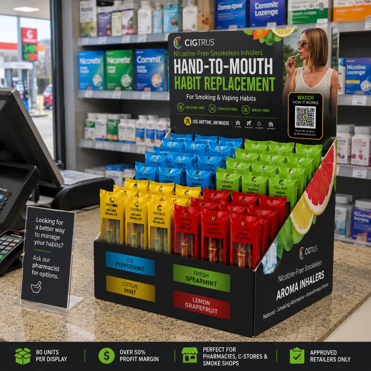
Cigtrus 80 count display positioned at a pharmacy checkout counter
SEE IT IN RETAIL
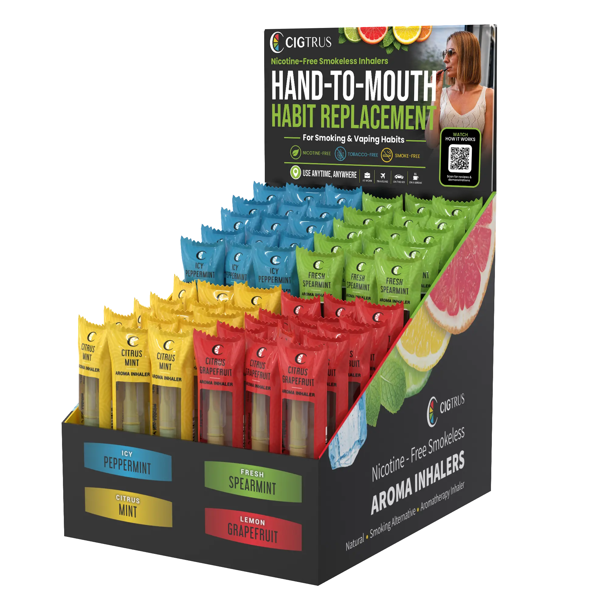
RETAIL-READY COUNTERTOP PROGRAM80 Count Display • Four Flavors • High-Visibility Placement
View Display →
:root{ --navy:#092d4c;--blue:#1777ad;--red:#d94b43;--green:#368c49;--yellow:#dda91f; --ink:#132b3e;--muted:#647482;--line:#d9e2e7;--paper:#fff;--wash:#f5f8fa; } *{box-sizing:border-box}html{scroll-behavior:smooth} body{margin:0;font-family:Arial,Helvetica,sans-serif;color:var(--ink);background:#fff;line-height:1.55} a{text-decoration:none;color:inherit}img{max-width:100%;display:block} .wrap{width:min(1160px,calc(100% - 48px));margin:auto} .preview{background:#092d4c;color:#fff;text-align:center;padding:9px 16px;font-size:12px;font-weight:700} .preview span{opacity:.7;font-weight:400} .kicker,.eyebrow{display:block;font-size:11px;font-weight:800;letter-spacing:.14em;text-transform:uppercase;color:var(--blue);margin-bottom:12px} h1,h2,h3,p{margin-top:0} h1{font-family:Georgia,"Times New Roman",serif;font-size:clamp(45px,5.6vw,72px);line-height:.98;letter-spacing:-.035em;color:var(--navy);font-weight:700;margin-bottom:24px} h1 span{display:block;color:var(--blue)} h2{font-family:Georgia,"Times New Roman",serif;font-size:clamp(31px,3.6vw,48px);line-height:1.04;letter-spacing:-.025em;color:var(--navy);font-weight:700;margin-bottom:15px} h3{font-size:19px;line-height:1.2;color:var(--navy);margin-bottom:9px} p{color:var(--muted)} .section-head{max-width:760px;margin:0 0 38px;text-align:left} .section-head p{font-size:16px;max-width:680px} .btn{display:inline-flex;align-items:center;justify-content:center;padding:13px 19px;font-size:14px;font-weight:800;border:1px solid transparent;transition:.18s} .btn:hover{transform:translateY(-1px)} .btn-blue{background:var(--blue);color:#fff}.btn-dark{background:var(--navy);color:#fff} .btn-outline{background:#fff;border-color:#9bb0bd;color:var(--navy)} .btn-apply{background:var(--red);color:#fff;border-color:var(--red)} .actions{display:flex;gap:10px;flex-wrap:wrap} /* 1 HERO — editorial split, no floating rounded card */ .hero{padding:74px 0 54px;background:#f3f8fb;border-bottom:1px solid var(--line)} .hero-grid{display:grid;grid-template-columns:.92fr 1.08fr;gap:46px;align-items:center} .hero-lead{font-size:18px;max-width:620px;margin-bottom:25px} .guide-link{display:inline-block;margin-top:15px;font-size:12px;font-weight:700;color:#526c7c;border-bottom:1px solid #b8c7cf;padding-bottom:2px} .pricing{font-size:12px;color:#7b8993;margin-top:12px} .hero-product{display:block;background:#fff;border-left:5px solid var(--red)} .hero-image{position:relative;min-height:455px;padding:10px 16px;display:flex;align-items:center;justify-content:center} .hero-image img{max-height:445px;max-width:96%;object-fit:contain}.hero-image.hero-retail{padding:0;overflow:hidden;background:#e8eef1}.hero-image.hero-retail img{width:100%;height:455px;max-width:none;max-height:none;object-fit:cover;object-position:center center} .badge{position:absolute;top:18px;left:18px;background:var(--navy);color:#fff;padding:7px 10px;font-size:10px;font-weight:800;letter-spacing:.08em} .hero-bar{background:#fff;border-top:1px solid var(--line);padding:18px 20px;display:grid;grid-template-columns:1fr auto;align-items:center;gap:18px;color:var(--navy)} .hero-bar small{display:block;font-size:10px;letter-spacing:.1em;color:#657681}.hero-bar strong{font-size:16px}.hero-bar a{align-self:center;white-space:nowrap;font-weight:800;color:var(--blue);border-bottom:1px solid #8fc3dd} .trust{display:grid;grid-template-columns:repeat(5,1fr);margin-top:32px;border-top:1px solid #cbd9e1;border-bottom:1px solid #cbd9e1} .trust div{padding:14px 9px;text-align:center;border-right:1px solid #cbd9e1}.trust div:last-child{border-right:0} .trust strong{display:block;font-size:19px;color:var(--navy)}.trust span{font-size:11px;color:#687985} .trust div:nth-child(1) strong{color:var(--red)}.trust div:nth-child(3) strong{color:var(--blue)}.trust div:nth-child(4) strong{color:var(--green)}.trust div:nth-child(5) strong{color:var(--yellow)} /* 2 PROGRAMS — flat catalog rows/cards */ .programs{padding:72px 0 78px;background:#fff}.programs .section-head{max-width:820px;margin:0 auto 42px;text-align:center}.programs .section-head p{margin-left:auto;margin-right:auto} .program-grid{display:grid;grid-template-columns:repeat(3,1fr);gap:0;border-top:1px solid var(--line);border-bottom:1px solid var(--line)} .card{display:block;padding:0 25px 28px;border-right:1px solid var(--line);background:#fff}.card:first-child{padding-left:0}.card:last-child{border-right:0;padding-right:0} .card-img{height:290px;display:flex;align-items:center;justify-content:center;padding:8px;position:relative;background:#f7f8f8;margin-bottom:20px} .card-img img{width:100%;height:100%;object-fit:contain;transform:scale(1.06)}.card-copy{padding:0} .card-copy p{font-size:14px;min-height:66px}.tags{display:none}.more{font-size:13px;font-weight:800;color:var(--blue);border-bottom:1px solid #9bc7df} /* 3 CORE — large photography and simple numbered process */ .core{padding:78px 0;background:#eef5f8} .core-grid{display:grid;grid-template-columns:.72fr 1.28fr;gap:42px;align-items:center} .core-copy>p{font-size:17px}.core-image{background:#fff}.core-image img{width:100%;height:500px;object-fit:cover} .core-visuals{display:grid;grid-template-columns:1.08fr .92fr;gap:14px;align-items:stretch} .core-visuals figure{margin:0;background:#fff;border:1px solid #d9e2e7} .lifestyle-figure img{width:100%;height:430px;object-fit:cover;object-position:center} .howto-figure{display:flex;flex-direction:column} .howto-figure img{width:100%;height:430px;object-fit:contain;background:#fff;padding:8px} .core-visuals figcaption{padding:13px 15px;font-size:12px;line-height:1.45;color:#5a6e7c;border-top:1px solid #e2e8eb} .core-visuals figcaption strong{color:#092d4c;font-size:13px} .steps{margin:27px 0;border-top:1px solid #bfcfd8} .step{display:grid;grid-template-columns:44px 1fr;align-items:center;padding:12px 0;border-bottom:1px solid #bfcfd8} .step b{font-size:12px;color:var(--red)}.step strong{font-size:13px;color:var(--navy)} .pills{display:flex;gap:16px;flex-wrap:wrap}.pills span{font-size:11px;font-weight:800;color:#3d5869} /* 4 FAMILIES — product catalog, square photography */ .families{padding:78px 0} .family-grid{display:grid;grid-template-columns:repeat(4,1fr);gap:24px} .family{display:block;border-top:4px solid var(--blue);padding-top:0} .family:nth-child(1){border-image:linear-gradient(90deg,var(--red),var(--blue),var(--green),var(--yellow)) 1} .family:nth-child(2){border-color:var(--green)}.family:nth-child(3){border-color:var(--blue)}.family:nth-child(4){border-color:var(--red)} .family-img{height:250px;background:#f5f6f6;margin-bottom:16px}.family-img img{width:100%;height:100%;object-fit:contain} .family-copy{padding:0}.family-copy p{font-size:13px;min-height:52px}.family-copy strong{font-size:12px;color:var(--blue);border-bottom:1px solid #9bc7df} /* 5 STORES — simple directory, less icon-card UI */ .stores{padding:76px 0;background:#f7f8f8;border-top:1px solid #e5eaed;border-bottom:1px solid #e5eaed} .store-layout{display:grid;grid-template-columns:1fr 280px;gap:38px} .store-grid{display:grid;grid-template-columns:repeat(2,1fr);border-top:1px solid var(--line)} .store{padding:18px 20px 18px 0;border-bottom:1px solid var(--line);min-height:112px} .store:nth-child(odd){border-right:1px solid var(--line)}.store:nth-child(even){padding-left:20px} .store-icon{font-size:23px;margin-bottom:7px}.store h3{font-size:16px}.store p{font-size:12px;margin:0} .guide-box{background:var(--navy);color:#fff;padding:30px 26px;display:flex;flex-direction:column;justify-content:center} .guide-box h3{color:#fff;font-family:Georgia,"Times New Roman",serif;font-size:25px}.guide-box p{color:#d1dde5;font-size:13px}.guide-box .pin{font-size:30px;margin-bottom:10px} /* 6 WHY — strong business strip, flatter benefit columns */ .why{padding:72px 0;background:#135a87;color:#fff} .why .section-head{margin-bottom:30px}.why .kicker{color:#d6efff}.why h2{color:#fff}.why .section-head p{color:#e2edf4} .why-grid{display:grid;grid-template-columns:repeat(4,1fr);border-top:1px solid rgba(255,255,255,.35)} .why-card{padding:27px 25px 10px 0;border-right:1px solid rgba(255,255,255,.28);min-height:210px} .why-card+ .why-card{padding-left:25px}.why-card:last-child{border-right:0} .why-big{font-family:Georgia,"Times New Roman",serif;font-size:49px;font-weight:700;line-height:1;color:#fff;margin-bottom:13px} .why-label{font-size:10px;font-weight:800;letter-spacing:.13em;color:#cfe8f7;margin-bottom:8px} .why-card h3{color:#fff;font-size:18px}.why-card p{color:#dce9f1;font-size:13px;margin-bottom:0} .why-symbol{width:38px;height:38px;display:flex;align-items:center;justify-content:center;font-size:23px;font-weight:800;margin-bottom:15px;color:#fff} .margin .why-big{color:#ffdad6}.demand .why-symbol{color:#cfefff}.wellness .why-symbol{color:#c9efcf}.nrt .why-symbol{color:#ffd0cc} /* 7 ACCOUNT — keep popup URLs/classes from approved V7 */ .partner{padding:76px 0;background:#fff} .partner-card{border-top:5px solid var(--navy);border-bottom:1px solid var(--line)} .partner-top{display:grid;grid-template-columns:.95fr 1.05fr;gap:50px;padding:38px 0} .partner-copy{padding:0}.partner-copy h2{font-size:clamp(35px,3.5vw,49px)}.partner-copy h2 .pricing-pop{color:var(--red)}.partner-copy p{font-size:15px} .benefits{display:grid;grid-template-columns:1fr 1fr;gap:10px;margin-top:20px}.benefits span{font-size:12px;font-weight:700;color:#435f70} .access{display:grid;grid-template-columns:1fr 1fr;border:1px solid var(--line)} .access-box{padding:28px;display:flex;flex-direction:column;min-height:255px;background:#fff} .access-box:first-child{border-right:1px solid var(--line);border-top:4px solid var(--red)} .access-box:last-child{border-top:4px solid var(--navy)} .access-box small{font-size:10px;font-weight:800;letter-spacing:.09em;color:#6a7d89}.access-box h3{font-size:20px;margin-top:10px} .access-box:first-child h3{color:var(--red)}.access-box p{font-size:12px;margin-bottom:18px}.access-box .btn{margin-top:auto;width:100%} .contact{border-top:1px solid var(--line);padding:16px 0;display:flex;gap:28px;flex-wrap:wrap;font-size:12px;font-weight:700;color:#365469} @media(max-width:900px){ .hero-grid,.core-grid,.partner-top{grid-template-columns:1fr}.core-visuals{grid-template-columns:1fr 1fr}.program-grid{grid-template-columns:1fr 1fr}.card:nth-child(2){border-right:0}.card:nth-child(3){margin-top:30px} .family-grid{grid-template-columns:1fr 1fr}.store-layout{grid-template-columns:1fr}.why-grid{grid-template-columns:1fr 1fr}.why-card:nth-child(2){border-right:0} } @media(max-width:620px){ .wrap{width:min(100% - 28px,1160px)}.hero,.programs,.core,.families,.stores,.why,.partner{padding:50px 0} h1{font-size:43px}h2{font-size:32px}.actions .btn{width:100%}.trust{grid-template-columns:repeat(2,1fr)}.trust div{border-bottom:1px solid #cbd9e1}.trust div:last-child{grid-column:1/-1} .program-grid,.family-grid,.store-grid,.why-grid,.access{grid-template-columns:1fr}.card,.card:first-child,.card:last-child{padding:0 0 26px;border-right:0}.card+ .card{margin-top:28px} .core-image img{height:auto}.core-visuals{grid-template-columns:1fr}.lifestyle-figure img,.howto-figure img{height:auto;max-height:none}.hero-image{min-height:360px}.hero-image img{max-height:350px}.hero-image.hero-retail img{height:360px;max-height:none}.card-img{height:250px}.store:nth-child(odd){border-right:0}.store:nth-child(even){padding-left:0}.why-card,.why-card+ .why-card{padding:22px 0;border-right:0;border-bottom:1px solid rgba(255,255,255,.25)} .partner-top{gap:25px}.access-box:first-child{border-right:0;border-bottom:1px solid var(--line)}.benefits{grid-template-columns:1fr} } .hero-image.hero-retail{padding:0;background:#fff;overflow:hidden;display:flex;align-items:center;justify-content:center} .hero-image.hero-retail img{width:100%;height:auto;max-width:100%;max-height:none;object-fit:contain;object-position:center} .product-story{padding:68px 0 74px;background:#fff} .product-story .story-head{max-width:760px;margin:0 auto 30px;text-align:center} .product-story .eyebrow{font-size:10px;font-weight:800;letter-spacing:.15em;color:#0b7fa3} .product-story h2{font-family:Georgia,'Times New Roman',serif;font-size:38px;line-height:1.08;color:#092d4c;margin:10px 0 10px} .product-story p{font-size:14px;color:#5a6e7c;margin:0} .story-visual{max-width:1040px;margin:0 auto;background:#fff} .story-visual img{display:block;width:100%;height:auto;object-fit:contain} @media(max-width:760px){.product-story{padding:48px 0}.product-story h2{font-size:30px}} /* V8.5 compact product-story override */ .product-story{padding:62px 0;background:#fff} .product-story .story-row{display:grid;grid-template-columns:.72fr 1.28fr;gap:46px;align-items:center;max-width:1100px;margin:0 auto} .product-story .story-copy{text-align:left} .product-story .story-copy .eyebrow{font-size:10px;font-weight:800;letter-spacing:.15em;color:#0b7fa3} .product-story .story-copy h2{font-family:Georgia,'Times New Roman',serif;font-size:38px;line-height:1.08;color:#092d4c;margin:10px 0 14px} .product-story .story-copy p{font-size:14px;line-height:1.65;color:#5a6e7c;margin:0 0 20px} .product-story .story-points{display:flex;flex-wrap:wrap;gap:8px 16px;padding-top:15px;border-top:1px solid #d7e1e6} .product-story .story-points span{font-size:11px;font-weight:800;color:#173b55} .product-story .story-visual{max-width:none;margin:0;background:#fff;display:flex;align-items:center;justify-content:center} .product-story .story-visual img{display:block;width:100%;height:410px;object-fit:contain} @media(max-width:900px){ .product-story .story-row{grid-template-columns:1fr;gap:25px} .product-story .story-copy{text-align:center} .product-story .story-points{justify-content:center} .product-story .story-visual img{height:auto;max-height:520px} } /* V8.6 — fuller desktop editorial layout */ @media(min-width:1100px){ .wrap{max-width:1280px} .hero .wrap{max-width:1280px} .hero-grid{grid-template-columns:.88fr 1.12fr;gap:54px} .hero-copy h1{font-size:64px;line-height:.95} .hero-copy>p{font-size:17px;line-height:1.55;max-width:590px} .hero-image.hero-retail img{width:100%;max-height:560px;object-fit:contain} .programs .wrap,.core .wrap,.families .wrap,.stores .wrap,.why .wrap,.partner .wrap{max-width:1280px} .program-grid{gap:0} .program-card img{width:100%} .core-grid{grid-template-columns:.76fr 1.24fr;gap:52px} .core-copy h2{font-size:48px} .core-copy>p{font-size:16px;line-height:1.55} .core-visuals{grid-template-columns:1.08fr .92fr;gap:18px} .product-story .story-row{max-width:1280px;grid-template-columns:.82fr 1.18fr;gap:58px} .product-story .story-copy h2{font-size:46px} .product-story .story-copy p{font-size:16px;max-width:520px} .product-story .story-visual img{height:500px} .families-grid,.store-grid{width:100%} .why-grid{width:100%} .partner-grid{width:100%} } @media(min-width:1450px){ .wrap,.hero .wrap,.programs .wrap,.core .wrap,.families .wrap,.stores .wrap,.why .wrap,.partner .wrap{max-width:1320px} } /* ================= V9 FINAL REFINEMENTS ================= */ .product-story{padding:68px 0;background:#fff} .product-story .story-three{ display:grid; grid-template-columns:1fr .82fr 1fr; gap:34px; align-items:center; max-width:1320px; margin:0 auto } .product-story .story-side{ min-width:0; display:flex; align-items:center; justify-content:center } .product-story .story-side img{ display:block; width:100%; height:430px; object-fit:contain; background:#fff } .product-story .story-center{text-align:center;padding:0 8px} .product-story .story-center .eyebrow{ font-size:10px;font-weight:800;letter-spacing:.15em;color:#0b7fa3 } .product-story .story-center h2{ font-family:Georgia,'Times New Roman',serif; color:#092d4c;font-size:42px;line-height:1.03;margin:10px 0 16px } .product-story .story-center p{ font-size:14px;line-height:1.65;color:#5a6e7c;margin:0 auto 22px;max-width:390px } .product-story .story-points{ display:grid;grid-template-columns:1fr 1fr;gap:0 16px; border-top:1px solid #d7e1e6 } .product-story .story-points span{ font-size:11px;font-weight:800;color:#173b55; padding:10px 0;border-bottom:1px solid #d7e1e6 } /* Keep V8.6's imagery-rich sections intact and give images room to read */ @media(min-width:1100px){ .programs .card-img{height:260px} .programs .card-img img{max-height:245px} .core-visuals{grid-template-columns:1.08fr .92fr} .core-visuals figure img{min-height:390px} .family-img{height:245px} .family-img img{max-height:230px} } @media(max-width:1000px){ .product-story .story-three{grid-template-columns:1fr 1fr} .product-story .story-center{grid-column:1 / -1;grid-row:1} .product-story .story-left{grid-column:1;grid-row:2} .product-story .story-right{grid-column:2;grid-row:2} .product-story .story-side img{height:390px} } @media(max-width:650px){ .product-story .story-three{grid-template-columns:1fr} .product-story .story-center,.product-story .story-left,.product-story .story-right{grid-column:1;grid-row:auto} .product-story .story-side img{height:auto;max-height:470px} } /* ========================================================= CIGTRUS V9 FINAL WIDE — GLOBAL LAYOUT ONLY Approved V9.1 design, widened for desktop. ========================================================= */ @media (min-width:1201px){ .wrap, .hero .wrap, .programs .wrap, .core .wrap, .families .wrap, .stores .wrap, .why .wrap, .partner .wrap{ width:calc(100% - 64px)!important; max-width:1460px!important; padding-left:0!important; padding-right:0!important; } .product-story .story-row{ width:calc(100% - 64px)!important; max-width:1460px!important; } } /* Remove unintended hero divider/accent line after widening. */ @media (min-width:901px){ .hero-copy, .hero-copy:before, .hero-copy:after, .hero-grid > div:first-child{ border-left:0!important; border-right:0!important; } .hero-copy:before, .hero-copy:after{content:none!important} } /* Preserve comfortable tablet/mobile gutters. */ @media (max-width:1200px){ .wrap, .hero .wrap, .programs .wrap, .core .wrap, .families .wrap, .stores .wrap, .why .wrap, .partner .wrap{width:calc(100% - 40px)!important} } @media (max-width:650px){ .wrap, .hero .wrap, .programs .wrap, .core .wrap, .families .wrap, .stores .wrap, .why .wrap, .partner .wrap{width:calc(100% - 30px)!important} } /* FINAL CLEANUP — RETAIL PROGRAMS Remove gray image wells while preserving the approved layout and product sizing. */ .programs .card-img{ background:transparent!important; }
:root{ --navy:#092d4c;--blue:#1777ad;--red:#d94b43;--green:#368c49;--yellow:#dda91f; --ink:#132b3e;--muted:#647482;--line:#d9e2e7;--paper:#fff;--wash:#f5f8fa; } *{box-sizing:border-box}html{scroll-behavior:smooth} body{margin:0;font-family:Arial,Helvetica,sans-serif;color:var(--ink);background:#fff;line-height:1.55} a{text-decoration:none;color:inherit}img{max-width:100%;display:block} .wrap{width:min(1160px,calc(100% - 48px));margin:auto} .preview{background:#092d4c;color:#fff;text-align:center;padding:9px 16px;font-size:12px;font-weight:700} .preview span{opacity:.7;font-weight:400} .kicker,.eyebrow{display:block;font-size:11px;font-weight:800;letter-spacing:.14em;text-transform:uppercase;color:var(--blue);margin-bottom:12px} h1,h2,h3,p{margin-top:0} h1{font-family:Georgia,"Times New Roman",serif;font-size:clamp(45px,5.6vw,72px);line-height:.98;letter-spacing:-.035em;color:var(--navy);font-weight:700;margin-bottom:24px} h1 span{display:block;color:var(--blue)} h2{font-family:Georgia,"Times New Roman",serif;font-size:clamp(31px,3.6vw,48px);line-height:1.04;letter-spacing:-.025em;color:var(--navy);font-weight:700;margin-bottom:15px} h3{font-size:19px;line-height:1.2;color:var(--navy);margin-bottom:9px} p{color:var(--muted)} .section-head{max-width:760px;margin:0 0 38px;text-align:left} .section-head p{font-size:16px;max-width:680px} .btn{display:inline-flex;align-items:center;justify-content:center;padding:13px 19px;font-size:14px;font-weight:800;border:1px solid transparent;transition:.18s} .btn:hover{transform:translateY(-1px)} .btn-blue{background:var(--blue);color:#fff}.btn-dark{background:var(--navy);color:#fff} .btn-outline{background:#fff;border-color:#9bb0bd;color:var(--navy)} .btn-apply{background:var(--red);color:#fff;border-color:var(--red)} .actions{display:flex;gap:10px;flex-wrap:wrap} /* 1 HERO — editorial split, no floating rounded card */ .hero{padding:74px 0 54px;background:#f3f8fb;border-bottom:1px solid var(--line)} .hero-grid{display:grid;grid-template-columns:.92fr 1.08fr;gap:46px;align-items:center} .hero-lead{font-size:18px;max-width:620px;margin-bottom:25px} .guide-link{display:inline-block;margin-top:15px;font-size:12px;font-weight:700;color:#526c7c;border-bottom:1px solid #b8c7cf;padding-bottom:2px} .pricing{font-size:12px;color:#7b8993;margin-top:12px} .hero-product{display:block;background:#fff;border-left:5px solid var(--red)} .hero-image{position:relative;min-height:455px;padding:10px 16px;display:flex;align-items:center;justify-content:center} .hero-image img{max-height:445px;max-width:96%;object-fit:contain}.hero-image.hero-retail{padding:0;overflow:hidden;background:#e8eef1}.hero-image.hero-retail img{width:100%;height:455px;max-width:none;max-height:none;object-fit:cover;object-position:center center} .badge{position:absolute;top:18px;left:18px;background:var(--navy);color:#fff;padding:7px 10px;font-size:10px;font-weight:800;letter-spacing:.08em} .hero-bar{background:#fff;border-top:1px solid var(--line);padding:18px 20px;display:grid;grid-template-columns:1fr auto;align-items:center;gap:18px;color:var(--navy)} .hero-bar small{display:block;font-size:10px;letter-spacing:.1em;color:#657681}.hero-bar strong{font-size:16px}.hero-bar a{align-self:center;white-space:nowrap;font-weight:800;color:var(--blue);border-bottom:1px solid #8fc3dd} .trust{display:grid;grid-template-columns:repeat(5,1fr);margin-top:32px;border-top:1px solid #cbd9e1;border-bottom:1px solid #cbd9e1} .trust div{padding:14px 9px;text-align:center;border-right:1px solid #cbd9e1}.trust div:last-child{border-right:0} .trust strong{display:block;font-size:19px;color:var(--navy)}.trust span{font-size:11px;color:#687985} .trust div:nth-child(1) strong{color:var(--red)}.trust div:nth-child(3) strong{color:var(--blue)}.trust div:nth-child(4) strong{color:var(--green)}.trust div:nth-child(5) strong{color:var(--yellow)} /* 2 PROGRAMS — flat catalog rows/cards */ .programs{padding:72px 0 78px;background:#fff}.programs .section-head{max-width:820px;margin:0 auto 42px;text-align:center}.programs .section-head p{margin-left:auto;margin-right:auto} .program-grid{display:grid;grid-template-columns:repeat(3,1fr);gap:0;border-top:1px solid var(--line);border-bottom:1px solid var(--line)} .card{display:block;padding:0 25px 28px;border-right:1px solid var(--line);background:#fff}.card:first-child{padding-left:0}.card:last-child{border-right:0;padding-right:0} .card-img{height:290px;display:flex;align-items:center;justify-content:center;padding:8px;position:relative;background:#f7f8f8;margin-bottom:20px} .card-img img{width:100%;height:100%;object-fit:contain;transform:scale(1.06)}.card-copy{padding:0} .card-copy p{font-size:14px;min-height:66px}.tags{display:none}.more{font-size:13px;font-weight:800;color:var(--blue);border-bottom:1px solid #9bc7df} /* 3 CORE — large photography and simple numbered process */ .core{padding:78px 0;background:#eef5f8} .core-grid{display:grid;grid-template-columns:.72fr 1.28fr;gap:42px;align-items:center} .core-copy>p{font-size:17px}.core-image{background:#fff}.core-image img{width:100%;height:500px;object-fit:cover} .core-visuals{display:grid;grid-template-columns:1.08fr .92fr;gap:14px;align-items:stretch} .core-visuals figure{margin:0;background:#fff;border:1px solid #d9e2e7} .lifestyle-figure img{width:100%;height:430px;object-fit:cover;object-position:center} .howto-figure{display:flex;flex-direction:column} .howto-figure img{width:100%;height:430px;object-fit:contain;background:#fff;padding:8px} .core-visuals figcaption{padding:13px 15px;font-size:12px;line-height:1.45;color:#5a6e7c;border-top:1px solid #e2e8eb} .core-visuals figcaption strong{color:#092d4c;font-size:13px} .steps{margin:27px 0;border-top:1px solid #bfcfd8} .step{display:grid;grid-template-columns:44px 1fr;align-items:center;padding:12px 0;border-bottom:1px solid #bfcfd8} .step b{font-size:12px;color:var(--red)}.step strong{font-size:13px;color:var(--navy)} .pills{display:flex;gap:16px;flex-wrap:wrap}.pills span{font-size:11px;font-weight:800;color:#3d5869} /* 4 FAMILIES — product catalog, square photography */ .families{padding:78px 0} .family-grid{display:grid;grid-template-columns:repeat(4,1fr);gap:24px} .family{display:block;border-top:4px solid var(--blue);padding-top:0} .family:nth-child(1){border-image:linear-gradient(90deg,var(--red),var(--blue),var(--green),var(--yellow)) 1} .family:nth-child(2){border-color:var(--green)}.family:nth-child(3){border-color:var(--blue)}.family:nth-child(4){border-color:var(--red)} .family-img{height:250px;background:#f5f6f6;margin-bottom:16px}.family-img img{width:100%;height:100%;object-fit:contain} .family-copy{padding:0}.family-copy p{font-size:13px;min-height:52px}.family-copy strong{font-size:12px;color:var(--blue);border-bottom:1px solid #9bc7df} /* 5 STORES — simple directory, less icon-card UI */ .stores{padding:76px 0;background:#f7f8f8;border-top:1px solid #e5eaed;border-bottom:1px solid #e5eaed} .store-layout{display:grid;grid-template-columns:1fr 280px;gap:38px} .store-grid{display:grid;grid-template-columns:repeat(2,1fr);border-top:1px solid var(--line)} .store{padding:18px 20px 18px 0;border-bottom:1px solid var(--line);min-height:112px} .store:nth-child(odd){border-right:1px solid var(--line)}.store:nth-child(even){padding-left:20px} .store-icon{font-size:23px;margin-bottom:7px}.store h3{font-size:16px}.store p{font-size:12px;margin:0} .guide-box{background:var(--navy);color:#fff;padding:30px 26px;display:flex;flex-direction:column;justify-content:center} .guide-box h3{color:#fff;font-family:Georgia,"Times New Roman",serif;font-size:25px}.guide-box p{color:#d1dde5;font-size:13px}.guide-box .pin{font-size:30px;margin-bottom:10px} /* 6 WHY — strong business strip, flatter benefit columns */ .why{padding:72px 0;background:#135a87;color:#fff} .why .section-head{margin-bottom:30px}.why .kicker{color:#d6efff}.why h2{color:#fff}.why .section-head p{color:#e2edf4} .why-grid{display:grid;grid-template-columns:repeat(4,1fr);border-top:1px solid rgba(255,255,255,.35)} .why-card{padding:27px 25px 10px 0;border-right:1px solid rgba(255,255,255,.28);min-height:210px} .why-card+ .why-card{padding-left:25px}.why-card:last-child{border-right:0} .why-big{font-family:Georgia,"Times New Roman",serif;font-size:49px;font-weight:700;line-height:1;color:#fff;margin-bottom:13px} .why-label{font-size:10px;font-weight:800;letter-spacing:.13em;color:#cfe8f7;margin-bottom:8px} .why-card h3{color:#fff;font-size:18px}.why-card p{color:#dce9f1;font-size:13px;margin-bottom:0} .why-symbol{width:38px;height:38px;display:flex;align-items:center;justify-content:center;font-size:23px;font-weight:800;margin-bottom:15px;color:#fff} .margin .why-big{color:#ffdad6}.demand .why-symbol{color:#cfefff}.wellness .why-symbol{color:#c9efcf}.nrt .why-symbol{color:#ffd0cc} /* 7 ACCOUNT — keep popup URLs/classes from approved V7 */ .partner{padding:76px 0;background:#fff} .partner-card{border-top:5px solid var(--navy);border-bottom:1px solid var(--line)} .partner-top{display:grid;grid-template-columns:.95fr 1.05fr;gap:50px;padding:38px 0} .partner-copy{padding:0}.partner-copy h2{font-size:clamp(35px,3.5vw,49px)}.partner-copy h2 .pricing-pop{color:var(--red)}.partner-copy p{font-size:15px} .benefits{display:grid;grid-template-columns:1fr 1fr;gap:10px;margin-top:20px}.benefits span{font-size:12px;font-weight:700;color:#435f70} .access{display:grid;grid-template-columns:1fr 1fr;border:1px solid var(--line)} .access-box{padding:28px;display:flex;flex-direction:column;min-height:255px;background:#fff} .access-box:first-child{border-right:1px solid var(--line);border-top:4px solid var(--red)} .access-box:last-child{border-top:4px solid var(--navy)} .access-box small{font-size:10px;font-weight:800;letter-spacing:.09em;color:#6a7d89}.access-box h3{font-size:20px;margin-top:10px} .access-box:first-child h3{color:var(--red)}.access-box p{font-size:12px;margin-bottom:18px}.access-box .btn{margin-top:auto;width:100%} .contact{border-top:1px solid var(--line);padding:16px 0;display:flex;gap:28px;flex-wrap:wrap;font-size:12px;font-weight:700;color:#365469} @media(max-width:900px){ .hero-grid,.core-grid,.partner-top{grid-template-columns:1fr}.core-visuals{grid-template-columns:1fr 1fr}.program-grid{grid-template-columns:1fr 1fr}.card:nth-child(2){border-right:0}.card:nth-child(3){margin-top:30px} .family-grid{grid-template-columns:1fr 1fr}.store-layout{grid-template-columns:1fr}.why-grid{grid-template-columns:1fr 1fr}.why-card:nth-child(2){border-right:0} } @media(max-width:620px){ .wrap{width:min(100% - 28px,1160px)}.hero,.programs,.core,.families,.stores,.why,.partner{padding:50px 0} h1{font-size:43px}h2{font-size:32px}.actions .btn{width:100%}.trust{grid-template-columns:repeat(2,1fr)}.trust div{border-bottom:1px solid #cbd9e1}.trust div:last-child{grid-column:1/-1} .program-grid,.family-grid,.store-grid,.why-grid,.access{grid-template-columns:1fr}.card,.card:first-child,.card:last-child{padding:0 0 26px;border-right:0}.card+ .card{margin-top:28px} .core-image img{height:auto}.core-visuals{grid-template-columns:1fr}.lifestyle-figure img,.howto-figure img{height:auto;max-height:none}.hero-image{min-height:360px}.hero-image img{max-height:350px}.hero-image.hero-retail img{height:360px;max-height:none}.card-img{height:250px}.store:nth-child(odd){border-right:0}.store:nth-child(even){padding-left:0}.why-card,.why-card+ .why-card{padding:22px 0;border-right:0;border-bottom:1px solid rgba(255,255,255,.25)} .partner-top{gap:25px}.access-box:first-child{border-right:0;border-bottom:1px solid var(--line)}.benefits{grid-template-columns:1fr} } .hero-image.hero-retail{padding:0;background:#fff;overflow:hidden;display:flex;align-items:center;justify-content:center} .hero-image.hero-retail img{width:100%;height:auto;max-width:100%;max-height:none;object-fit:contain;object-position:center} .product-story{padding:68px 0 74px;background:#fff} .product-story .story-head{max-width:760px;margin:0 auto 30px;text-align:center} .product-story .eyebrow{font-size:10px;font-weight:800;letter-spacing:.15em;color:#0b7fa3} .product-story h2{font-family:Georgia,'Times New Roman',serif;font-size:38px;line-height:1.08;color:#092d4c;margin:10px 0 10px} .product-story p{font-size:14px;color:#5a6e7c;margin:0} .story-visual{max-width:1040px;margin:0 auto;background:#fff} .story-visual img{display:block;width:100%;height:auto;object-fit:contain} @media(max-width:760px){.product-story{padding:48px 0}.product-story h2{font-size:30px}} /* V8.5 compact product-story override */ .product-story{padding:62px 0;background:#fff} .product-story .story-row{display:grid;grid-template-columns:.72fr 1.28fr;gap:46px;align-items:center;max-width:1100px;margin:0 auto} .product-story .story-copy{text-align:left} .product-story .story-copy .eyebrow{font-size:10px;font-weight:800;letter-spacing:.15em;color:#0b7fa3} .product-story .story-copy h2{font-family:Georgia,'Times New Roman',serif;font-size:38px;line-height:1.08;color:#092d4c;margin:10px 0 14px} .product-story .story-copy p{font-size:14px;line-height:1.65;color:#5a6e7c;margin:0 0 20px} .product-story .story-points{display:flex;flex-wrap:wrap;gap:8px 16px;padding-top:15px;border-top:1px solid #d7e1e6} .product-story .story-points span{font-size:11px;font-weight:800;color:#173b55} .product-story .story-visual{max-width:none;margin:0;background:#fff;display:flex;align-items:center;justify-content:center} .product-story .story-visual img{display:block;width:100%;height:410px;object-fit:contain} @media(max-width:900px){ .product-story .story-row{grid-template-columns:1fr;gap:25px} .product-story .story-copy{text-align:center} .product-story .story-points{justify-content:center} .product-story .story-visual img{height:auto;max-height:520px} } /* V8.6 — fuller desktop editorial layout */ @media(min-width:1100px){ .wrap{max-width:1280px} .hero .wrap{max-width:1280px} .hero-grid{grid-template-columns:.88fr 1.12fr;gap:54px} .hero-copy h1{font-size:64px;line-height:.95} .hero-copy>p{font-size:17px;line-height:1.55;max-width:590px} .hero-image.hero-retail img{width:100%;max-height:560px;object-fit:contain} .programs .wrap,.core .wrap,.families .wrap,.stores .wrap,.why .wrap,.partner .wrap{max-width:1280px} .program-grid{gap:0} .program-card img{width:100%} .core-grid{grid-template-columns:.76fr 1.24fr;gap:52px} .core-copy h2{font-size:48px} .core-copy>p{font-size:16px;line-height:1.55} .core-visuals{grid-template-columns:1.08fr .92fr;gap:18px} .product-story .story-row{max-width:1280px;grid-template-columns:.82fr 1.18fr;gap:58px} .product-story .story-copy h2{font-size:46px} .product-story .story-copy p{font-size:16px;max-width:520px} .product-story .story-visual img{height:500px} .families-grid,.store-grid{width:100%} .why-grid{width:100%} .partner-grid{width:100%} } @media(min-width:1450px){ .wrap,.hero .wrap,.programs .wrap,.core .wrap,.families .wrap,.stores .wrap,.why .wrap,.partner .wrap{max-width:1320px} } /* ================= V9 FINAL REFINEMENTS ================= */ .product-story{padding:68px 0;background:#fff} .product-story .story-three{ display:grid; grid-template-columns:1fr .82fr 1fr; gap:34px; align-items:center; max-width:1320px; margin:0 auto } .product-story .story-side{ min-width:0; display:flex; align-items:center; justify-content:center } .product-story .story-side img{ display:block; width:100%; height:430px; object-fit:contain; background:#fff } .product-story .story-center{text-align:center;padding:0 8px} .product-story .story-center .eyebrow{ font-size:10px;font-weight:800;letter-spacing:.15em;color:#0b7fa3 } .product-story .story-center h2{ font-family:Georgia,'Times New Roman',serif; color:#092d4c;font-size:42px;line-height:1.03;margin:10px 0 16px } .product-story .story-center p{ font-size:14px;line-height:1.65;color:#5a6e7c;margin:0 auto 22px;max-width:390px } .product-story .story-points{ display:grid;grid-template-columns:1fr 1fr;gap:0 16px; border-top:1px solid #d7e1e6 } .product-story .story-points span{ font-size:11px;font-weight:800;color:#173b55; padding:10px 0;border-bottom:1px solid #d7e1e6 } /* Keep V8.6's imagery-rich sections intact and give images room to read */ @media(min-width:1100px){ .programs .card-img{height:260px} .programs .card-img img{max-height:245px} .core-visuals{grid-template-columns:1.08fr .92fr} .core-visuals figure img{min-height:390px} .family-img{height:245px} .family-img img{max-height:230px} } @media(max-width:1000px){ .product-story .story-three{grid-template-columns:1fr 1fr} .product-story .story-center{grid-column:1 / -1;grid-row:1} .product-story .story-left{grid-column:1;grid-row:2} .product-story .story-right{grid-column:2;grid-row:2} .product-story .story-side img{height:390px} } @media(max-width:650px){ .product-story .story-three{grid-template-columns:1fr} .product-story .story-center,.product-story .story-left,.product-story .story-right{grid-column:1;grid-row:auto} .product-story .story-side img{height:auto;max-height:470px} } /* V9.1 instructional video CTA */ .how-video-link{display:flex;align-items:center;gap:10px;text-decoration:none;color:#153b54} .how-video-link:hover{text-decoration:none} .how-video-play{width:28px;height:28px;flex:0 0 28px;border-radius:50%;background:#e34c43;color:#fff;display:inline-flex;align-items:center;justify-content:center;font-size:10px;padding-left:2px} .how-video-link strong{display:block;font-size:12px;color:#0a3655;margin-bottom:2px} .how-video-link small{display:block;font-size:10px;color:#627986} /* ========================================================= CIGTRUS V9 FINAL WIDE — GLOBAL LAYOUT ONLY Approved V9.1 design, widened for desktop. ========================================================= */ @media (min-width:1201px){ .wrap, .hero .wrap, .programs .wrap, .core .wrap, .families .wrap, .stores .wrap, .why .wrap, .partner .wrap{ width:calc(100% - 64px)!important; max-width:1460px!important; padding-left:0!important; padding-right:0!important; } .product-story .story-row{ width:calc(100% - 64px)!important; max-width:1460px!important; } } /* Remove unintended hero divider/accent line after widening. */ @media (min-width:901px){ .hero-copy, .hero-copy:before, .hero-copy:after, .hero-grid > div:first-child{ border-left:0!important; border-right:0!important; } .hero-copy:before, .hero-copy:after{content:none!important} } /* Preserve comfortable tablet/mobile gutters. */ @media (max-width:1200px){ .wrap, .hero .wrap, .programs .wrap, .core .wrap, .families .wrap, .stores .wrap, .why .wrap, .partner .wrap{width:calc(100% - 40px)!important} } @media (max-width:650px){ .wrap, .hero .wrap, .programs .wrap, .core .wrap, .families .wrap, .stores .wrap, .why .wrap, .partner .wrap{width:calc(100% - 30px)!important} }
THE ORIGINAL CIGTRUS

See It. Understand It. Use It.

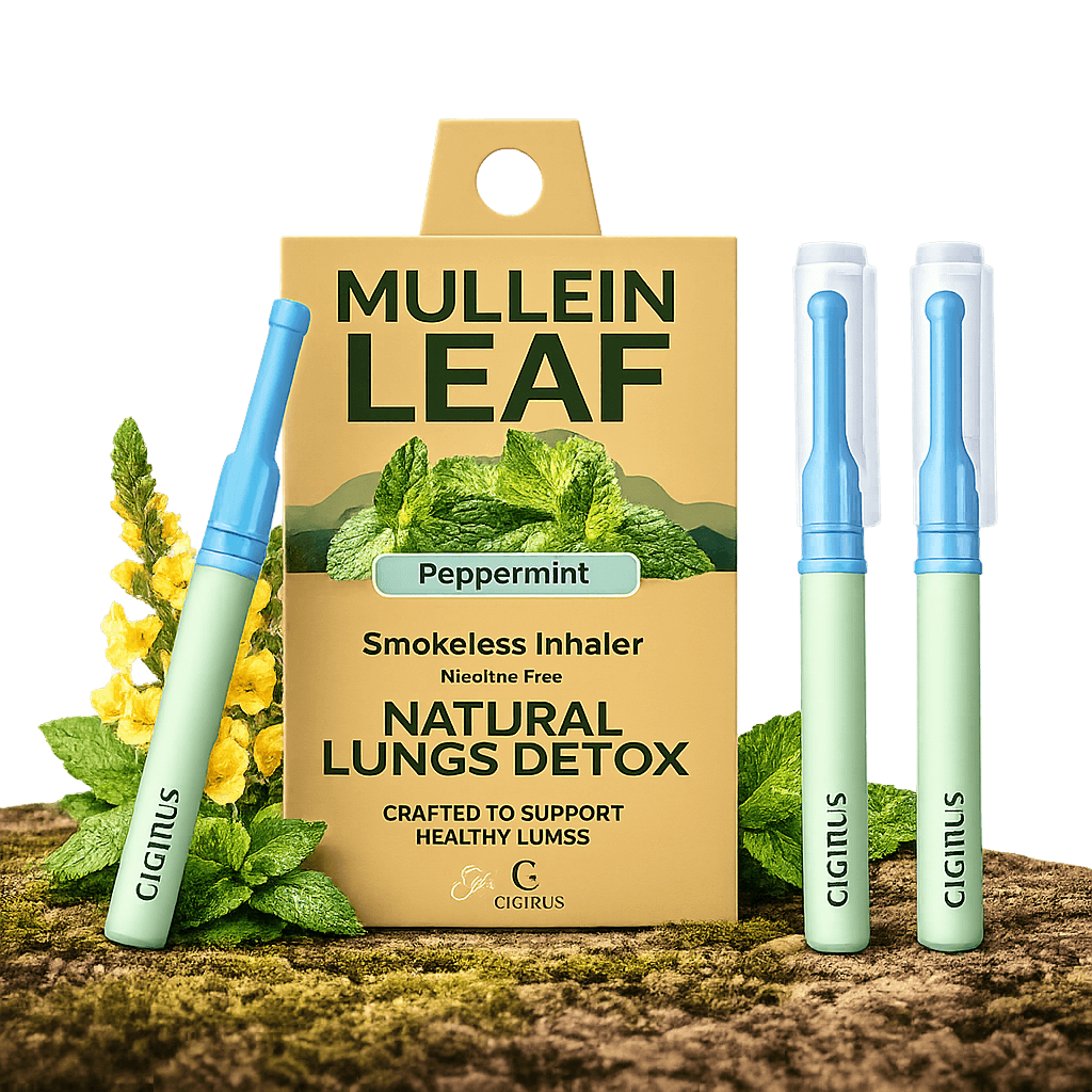
Cigtrus is a nicotine-free, tobacco-free smokeless inhaler that delivers refreshing flavored air through a familiar hand-to-mouth experience.

No battery. No charging. No heat. No smoke. No vapor.

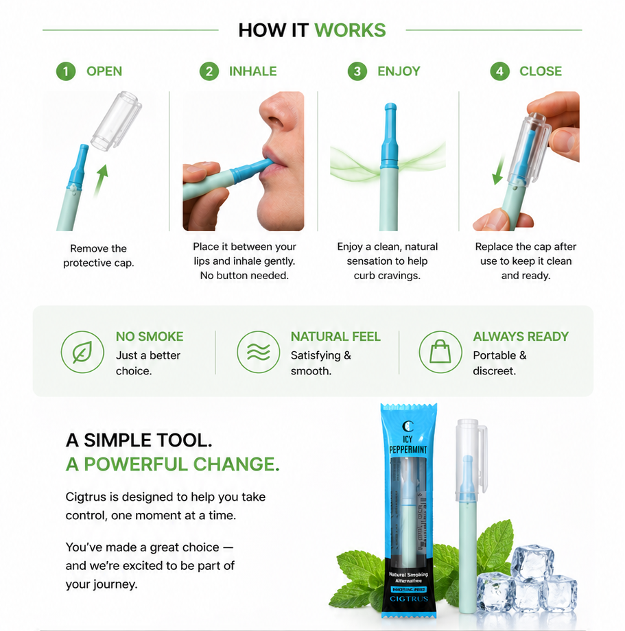
01Remove Both Caps
02Take a Gentle Draw
03Re-Cap Between Uses
Nicotine-FreeTobacco-FreeNon-ElectricEssential Oil AromasPocket Size
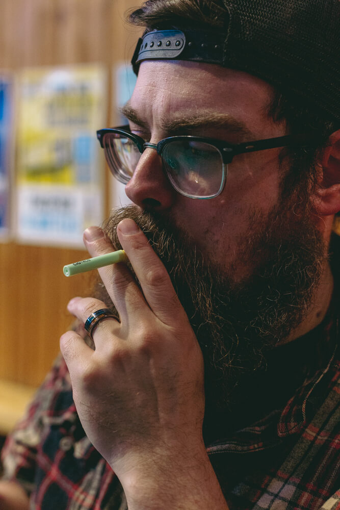
Customer using Cigtrus
Familiar hand-to-mouth experience.
Simple, portable and easy for customers to understand.
How to use Cigtrus nicotine-free smokeless inhaler
▶See How Cigtrus WorksWatch the quick product demonstration →
:root{ --navy:#092d4c;--blue:#1777ad;--red:#d94b43;--green:#368c49;--yellow:#dda91f; --ink:#132b3e;--muted:#647482;--line:#d9e2e7;--paper:#fff;--wash:#f5f8fa; } *{box-sizing:border-box}html{scroll-behavior:smooth} body{margin:0;font-family:Arial,Helvetica,sans-serif;color:var(--ink);background:#fff;line-height:1.55} a{text-decoration:none;color:inherit}img{max-width:100%;display:block} .wrap{width:min(1160px,calc(100% - 48px));margin:auto} .preview{background:#092d4c;color:#fff;text-align:center;padding:9px 16px;font-size:12px;font-weight:700} .preview span{opacity:.7;font-weight:400} .kicker,.eyebrow{display:block;font-size:11px;font-weight:800;letter-spacing:.14em;text-transform:uppercase;color:var(--blue);margin-bottom:12px} h1,h2,h3,p{margin-top:0} h1{font-family:Georgia,"Times New Roman",serif;font-size:clamp(45px,5.6vw,72px);line-height:.98;letter-spacing:-.035em;color:var(--navy);font-weight:700;margin-bottom:24px} h1 span{display:block;color:var(--blue)} h2{font-family:Georgia,"Times New Roman",serif;font-size:clamp(31px,3.6vw,48px);line-height:1.04;letter-spacing:-.025em;color:var(--navy);font-weight:700;margin-bottom:15px} h3{font-size:19px;line-height:1.2;color:var(--navy);margin-bottom:9px} p{color:var(--muted)} .section-head{max-width:760px;margin:0 0 38px;text-align:left} .section-head p{font-size:16px;max-width:680px} .btn{display:inline-flex;align-items:center;justify-content:center;padding:13px 19px;font-size:14px;font-weight:800;border:1px solid transparent;transition:.18s} .btn:hover{transform:translateY(-1px)} .btn-blue{background:var(--blue);color:#fff}.btn-dark{background:var(--navy);color:#fff} .btn-outline{background:#fff;border-color:#9bb0bd;color:var(--navy)} .btn-apply{background:var(--red);color:#fff;border-color:var(--red)} .actions{display:flex;gap:10px;flex-wrap:wrap} /* 1 HERO — editorial split, no floating rounded card */ .hero{padding:74px 0 54px;background:#f3f8fb;border-bottom:1px solid var(--line)} .hero-grid{display:grid;grid-template-columns:.92fr 1.08fr;gap:46px;align-items:center} .hero-lead{font-size:18px;max-width:620px;margin-bottom:25px} .guide-link{display:inline-block;margin-top:15px;font-size:12px;font-weight:700;color:#526c7c;border-bottom:1px solid #b8c7cf;padding-bottom:2px} .pricing{font-size:12px;color:#7b8993;margin-top:12px} .hero-product{display:block;background:#fff;border-left:5px solid var(--red)} .hero-image{position:relative;min-height:455px;padding:10px 16px;display:flex;align-items:center;justify-content:center} .hero-image img{max-height:445px;max-width:96%;object-fit:contain}.hero-image.hero-retail{padding:0;overflow:hidden;background:#e8eef1}.hero-image.hero-retail img{width:100%;height:455px;max-width:none;max-height:none;object-fit:cover;object-position:center center} .badge{position:absolute;top:18px;left:18px;background:var(--navy);color:#fff;padding:7px 10px;font-size:10px;font-weight:800;letter-spacing:.08em} .hero-bar{background:#fff;border-top:1px solid var(--line);padding:18px 20px;display:grid;grid-template-columns:1fr auto;align-items:center;gap:18px;color:var(--navy)} .hero-bar small{display:block;font-size:10px;letter-spacing:.1em;color:#657681}.hero-bar strong{font-size:16px}.hero-bar a{align-self:center;white-space:nowrap;font-weight:800;color:var(--blue);border-bottom:1px solid #8fc3dd} .trust{display:grid;grid-template-columns:repeat(5,1fr);margin-top:32px;border-top:1px solid #cbd9e1;border-bottom:1px solid #cbd9e1} .trust div{padding:14px 9px;text-align:center;border-right:1px solid #cbd9e1}.trust div:last-child{border-right:0} .trust strong{display:block;font-size:19px;color:var(--navy)}.trust span{font-size:11px;color:#687985} .trust div:nth-child(1) strong{color:var(--red)}.trust div:nth-child(3) strong{color:var(--blue)}.trust div:nth-child(4) strong{color:var(--green)}.trust div:nth-child(5) strong{color:var(--yellow)} /* 2 PROGRAMS — flat catalog rows/cards */ .programs{padding:72px 0 78px;background:#fff}.programs .section-head{max-width:820px;margin:0 auto 42px;text-align:center}.programs .section-head p{margin-left:auto;margin-right:auto} .program-grid{display:grid;grid-template-columns:repeat(3,1fr);gap:0;border-top:1px solid var(--line);border-bottom:1px solid var(--line)} .card{display:block;padding:0 25px 28px;border-right:1px solid var(--line);background:#fff}.card:first-child{padding-left:0}.card:last-child{border-right:0;padding-right:0} .card-img{height:290px;display:flex;align-items:center;justify-content:center;padding:8px;position:relative;background:#f7f8f8;margin-bottom:20px} .card-img img{width:100%;height:100%;object-fit:contain;transform:scale(1.06)}.card-copy{padding:0} .card-copy p{font-size:14px;min-height:66px}.tags{display:none}.more{font-size:13px;font-weight:800;color:var(--blue);border-bottom:1px solid #9bc7df} /* 3 CORE — large photography and simple numbered process */ .core{padding:78px 0;background:#eef5f8} .core-grid{display:grid;grid-template-columns:.72fr 1.28fr;gap:42px;align-items:center} .core-copy>p{font-size:17px}.core-image{background:#fff}.core-image img{width:100%;height:500px;object-fit:cover} .core-visuals{display:grid;grid-template-columns:1.08fr .92fr;gap:14px;align-items:stretch} .core-visuals figure{margin:0;background:#fff;border:1px solid #d9e2e7} .lifestyle-figure img{width:100%;height:430px;object-fit:cover;object-position:center} .howto-figure{display:flex;flex-direction:column} .howto-figure img{width:100%;height:430px;object-fit:contain;background:#fff;padding:8px} .core-visuals figcaption{padding:13px 15px;font-size:12px;line-height:1.45;color:#5a6e7c;border-top:1px solid #e2e8eb} .core-visuals figcaption strong{color:#092d4c;font-size:13px} .steps{margin:27px 0;border-top:1px solid #bfcfd8} .step{display:grid;grid-template-columns:44px 1fr;align-items:center;padding:12px 0;border-bottom:1px solid #bfcfd8} .step b{font-size:12px;color:var(--red)}.step strong{font-size:13px;color:var(--navy)} .pills{display:flex;gap:16px;flex-wrap:wrap}.pills span{font-size:11px;font-weight:800;color:#3d5869} /* 4 FAMILIES — product catalog, square photography */ .families{padding:78px 0} .family-grid{display:grid;grid-template-columns:repeat(4,1fr);gap:24px} .family{display:block;border-top:4px solid var(--blue);padding-top:0} .family:nth-child(1){border-image:linear-gradient(90deg,var(--red),var(--blue),var(--green),var(--yellow)) 1} .family:nth-child(2){border-color:var(--green)}.family:nth-child(3){border-color:var(--blue)}.family:nth-child(4){border-color:var(--red)} .family-img{height:250px;background:#f5f6f6;margin-bottom:16px}.family-img img{width:100%;height:100%;object-fit:contain} .family-copy{padding:0}.family-copy p{font-size:13px;min-height:52px}.family-copy strong{font-size:12px;color:var(--blue);border-bottom:1px solid #9bc7df} /* 5 STORES — simple directory, less icon-card UI */ .stores{padding:76px 0;background:#f7f8f8;border-top:1px solid #e5eaed;border-bottom:1px solid #e5eaed} .store-layout{display:grid;grid-template-columns:1fr 280px;gap:38px} .store-grid{display:grid;grid-template-columns:repeat(2,1fr);border-top:1px solid var(--line)} .store{padding:18px 20px 18px 0;border-bottom:1px solid var(--line);min-height:112px} .store:nth-child(odd){border-right:1px solid var(--line)}.store:nth-child(even){padding-left:20px} .store-icon{font-size:23px;margin-bottom:7px}.store h3{font-size:16px}.store p{font-size:12px;margin:0} .guide-box{background:var(--navy);color:#fff;padding:30px 26px;display:flex;flex-direction:column;justify-content:center} .guide-box h3{color:#fff;font-family:Georgia,"Times New Roman",serif;font-size:25px}.guide-box p{color:#d1dde5;font-size:13px}.guide-box .pin{font-size:30px;margin-bottom:10px} /* 6 WHY — strong business strip, flatter benefit columns */ .why{padding:72px 0;background:#135a87;color:#fff} .why .section-head{margin-bottom:30px}.why .kicker{color:#d6efff}.why h2{color:#fff}.why .section-head p{color:#e2edf4} .why-grid{display:grid;grid-template-columns:repeat(4,1fr);border-top:1px solid rgba(255,255,255,.35)} .why-card{padding:27px 25px 10px 0;border-right:1px solid rgba(255,255,255,.28);min-height:210px} .why-card+ .why-card{padding-left:25px}.why-card:last-child{border-right:0} .why-big{font-family:Georgia,"Times New Roman",serif;font-size:49px;font-weight:700;line-height:1;color:#fff;margin-bottom:13px} .why-label{font-size:10px;font-weight:800;letter-spacing:.13em;color:#cfe8f7;margin-bottom:8px} .why-card h3{color:#fff;font-size:18px}.why-card p{color:#dce9f1;font-size:13px;margin-bottom:0} .why-symbol{width:38px;height:38px;display:flex;align-items:center;justify-content:center;font-size:23px;font-weight:800;margin-bottom:15px;color:#fff} .margin .why-big{color:#ffdad6}.demand .why-symbol{color:#cfefff}.wellness .why-symbol{color:#c9efcf}.nrt .why-symbol{color:#ffd0cc} /* 7 ACCOUNT — keep popup URLs/classes from approved V7 */ .partner{padding:76px 0;background:#fff} .partner-card{border-top:5px solid var(--navy);border-bottom:1px solid var(--line)} .partner-top{display:grid;grid-template-columns:.95fr 1.05fr;gap:50px;padding:38px 0} .partner-copy{padding:0}.partner-copy h2{font-size:clamp(35px,3.5vw,49px)}.partner-copy h2 .pricing-pop{color:var(--red)}.partner-copy p{font-size:15px} .benefits{display:grid;grid-template-columns:1fr 1fr;gap:10px;margin-top:20px}.benefits span{font-size:12px;font-weight:700;color:#435f70} .access{display:grid;grid-template-columns:1fr 1fr;border:1px solid var(--line)} .access-box{padding:28px;display:flex;flex-direction:column;min-height:255px;background:#fff} .access-box:first-child{border-right:1px solid var(--line);border-top:4px solid var(--red)} .access-box:last-child{border-top:4px solid var(--navy)} .access-box small{font-size:10px;font-weight:800;letter-spacing:.09em;color:#6a7d89}.access-box h3{font-size:20px;margin-top:10px} .access-box:first-child h3{color:var(--red)}.access-box p{font-size:12px;margin-bottom:18px}.access-box .btn{margin-top:auto;width:100%} .contact{border-top:1px solid var(--line);padding:16px 0;display:flex;gap:28px;flex-wrap:wrap;font-size:12px;font-weight:700;color:#365469} @media(max-width:900px){ .hero-grid,.core-grid,.partner-top{grid-template-columns:1fr}.core-visuals{grid-template-columns:1fr 1fr}.program-grid{grid-template-columns:1fr 1fr}.card:nth-child(2){border-right:0}.card:nth-child(3){margin-top:30px} .family-grid{grid-template-columns:1fr 1fr}.store-layout{grid-template-columns:1fr}.why-grid{grid-template-columns:1fr 1fr}.why-card:nth-child(2){border-right:0} } @media(max-width:620px){ .wrap{width:min(100% - 28px,1160px)}.hero,.programs,.core,.families,.stores,.why,.partner{padding:50px 0} h1{font-size:43px}h2{font-size:32px}.actions .btn{width:100%}.trust{grid-template-columns:repeat(2,1fr)}.trust div{border-bottom:1px solid #cbd9e1}.trust div:last-child{grid-column:1/-1} .program-grid,.family-grid,.store-grid,.why-grid,.access{grid-template-columns:1fr}.card,.card:first-child,.card:last-child{padding:0 0 26px;border-right:0}.card+ .card{margin-top:28px} .core-image img{height:auto}.core-visuals{grid-template-columns:1fr}.lifestyle-figure img,.howto-figure img{height:auto;max-height:none}.hero-image{min-height:360px}.hero-image img{max-height:350px}.hero-image.hero-retail img{height:360px;max-height:none}.card-img{height:250px}.store:nth-child(odd){border-right:0}.store:nth-child(even){padding-left:0}.why-card,.why-card+ .why-card{padding:22px 0;border-right:0;border-bottom:1px solid rgba(255,255,255,.25)} .partner-top{gap:25px}.access-box:first-child{border-right:0;border-bottom:1px solid var(--line)}.benefits{grid-template-columns:1fr} } .hero-image.hero-retail{padding:0;background:#fff;overflow:hidden;display:flex;align-items:center;justify-content:center} .hero-image.hero-retail img{width:100%;height:auto;max-width:100%;max-height:none;object-fit:contain;object-position:center} .product-story{padding:68px 0 74px;background:#fff} .product-story .story-head{max-width:760px;margin:0 auto 30px;text-align:center} .product-story .eyebrow{font-size:10px;font-weight:800;letter-spacing:.15em;color:#0b7fa3} .product-story h2{font-family:Georgia,'Times New Roman',serif;font-size:38px;line-height:1.08;color:#092d4c;margin:10px 0 10px} .product-story p{font-size:14px;color:#5a6e7c;margin:0} .story-visual{max-width:1040px;margin:0 auto;background:#fff} .story-visual img{display:block;width:100%;height:auto;object-fit:contain} @media(max-width:760px){.product-story{padding:48px 0}.product-story h2{font-size:30px}} /* V8.5 compact product-story override */ .product-story{padding:62px 0;background:#fff} .product-story .story-row{display:grid;grid-template-columns:.72fr 1.28fr;gap:46px;align-items:center;max-width:1100px;margin:0 auto} .product-story .story-copy{text-align:left} .product-story .story-copy .eyebrow{font-size:10px;font-weight:800;letter-spacing:.15em;color:#0b7fa3} .product-story .story-copy h2{font-family:Georgia,'Times New Roman',serif;font-size:38px;line-height:1.08;color:#092d4c;margin:10px 0 14px} .product-story .story-copy p{font-size:14px;line-height:1.65;color:#5a6e7c;margin:0 0 20px} .product-story .story-points{display:flex;flex-wrap:wrap;gap:8px 16px;padding-top:15px;border-top:1px solid #d7e1e6} .product-story .story-points span{font-size:11px;font-weight:800;color:#173b55} .product-story .story-visual{max-width:none;margin:0;background:#fff;display:flex;align-items:center;justify-content:center} .product-story .story-visual img{display:block;width:100%;height:410px;object-fit:contain} @media(max-width:900px){ .product-story .story-row{grid-template-columns:1fr;gap:25px} .product-story .story-copy{text-align:center} .product-story .story-points{justify-content:center} .product-story .story-visual img{height:auto;max-height:520px} } /* V8.6 — fuller desktop editorial layout */ @media(min-width:1100px){ .wrap{max-width:1280px} .hero .wrap{max-width:1280px} .hero-grid{grid-template-columns:.88fr 1.12fr;gap:54px} .hero-copy h1{font-size:64px;line-height:.95} .hero-copy>p{font-size:17px;line-height:1.55;max-width:590px} .hero-image.hero-retail img{width:100%;max-height:560px;object-fit:contain} .programs .wrap,.core .wrap,.families .wrap,.stores .wrap,.why .wrap,.partner .wrap{max-width:1280px} .program-grid{gap:0} .program-card img{width:100%} .core-grid{grid-template-columns:.76fr 1.24fr;gap:52px} .core-copy h2{font-size:48px} .core-copy>p{font-size:16px;line-height:1.55} .core-visuals{grid-template-columns:1.08fr .92fr;gap:18px} .product-story .story-row{max-width:1280px;grid-template-columns:.82fr 1.18fr;gap:58px} .product-story .story-copy h2{font-size:46px} .product-story .story-copy p{font-size:16px;max-width:520px} .product-story .story-visual img{height:500px} .families-grid,.store-grid{width:100%} .why-grid{width:100%} .partner-grid{width:100%} } @media(min-width:1450px){ .wrap,.hero .wrap,.programs .wrap,.core .wrap,.families .wrap,.stores .wrap,.why .wrap,.partner .wrap{max-width:1320px} } /* ================= V9 FINAL REFINEMENTS ================= */ .product-story{padding:68px 0;background:#fff} .product-story .story-three{ display:grid; grid-template-columns:1fr .82fr 1fr; gap:34px; align-items:center; max-width:1320px; margin:0 auto } .product-story .story-side{ min-width:0; display:flex; align-items:center; justify-content:center } .product-story .story-side img{ display:block; width:100%; height:430px; object-fit:contain; background:#fff } .product-story .story-center{text-align:center;padding:0 8px} .product-story .story-center .eyebrow{ font-size:10px;font-weight:800;letter-spacing:.15em;color:#0b7fa3 } .product-story .story-center h2{ font-family:Georgia,'Times New Roman',serif; color:#092d4c;font-size:42px;line-height:1.03;margin:10px 0 16px } .product-story .story-center p{ font-size:14px;line-height:1.65;color:#5a6e7c;margin:0 auto 22px;max-width:390px } .product-story .story-points{ display:grid;grid-template-columns:1fr 1fr;gap:0 16px; border-top:1px solid #d7e1e6 } .product-story .story-points span{ font-size:11px;font-weight:800;color:#173b55; padding:10px 0;border-bottom:1px solid #d7e1e6 } /* Keep V8.6's imagery-rich sections intact and give images room to read */ @media(min-width:1100px){ .programs .card-img{height:260px} .programs .card-img img{max-height:245px} .core-visuals{grid-template-columns:1.08fr .92fr} .core-visuals figure img{min-height:390px} .family-img{height:245px} .family-img img{max-height:230px} } @media(max-width:1000px){ .product-story .story-three{grid-template-columns:1fr 1fr} .product-story .story-center{grid-column:1 / -1;grid-row:1} .product-story .story-left{grid-column:1;grid-row:2} .product-story .story-right{grid-column:2;grid-row:2} .product-story .story-side img{height:390px} } @media(max-width:650px){ .product-story .story-three{grid-template-columns:1fr} .product-story .story-center,.product-story .story-left,.product-story .story-right{grid-column:1;grid-row:auto} .product-story .story-side img{height:auto;max-height:470px} } /* ========================================================= CIGTRUS V9 FINAL WIDE — GLOBAL LAYOUT ONLY Approved V9.1 design, widened for desktop. ========================================================= */ @media (min-width:1201px){ .wrap, .hero .wrap, .programs .wrap, .core .wrap, .families .wrap, .stores .wrap, .why .wrap, .partner .wrap{ width:calc(100% - 64px)!important; max-width:1460px!important; padding-left:0!important; padding-right:0!important; } .product-story .story-row{ width:calc(100% - 64px)!important; max-width:1460px!important; } } /* Remove unintended hero divider/accent line after widening. */ @media (min-width:901px){ .hero-copy, .hero-copy:before, .hero-copy:after, .hero-grid > div:first-child{ border-left:0!important; border-right:0!important; } .hero-copy:before, .hero-copy:after{content:none!important} } /* Preserve comfortable tablet/mobile gutters. */ @media (max-width:1200px){ .wrap, .hero .wrap, .programs .wrap, .core .wrap, .families .wrap, .stores .wrap, .why .wrap, .partner .wrap{width:calc(100% - 40px)!important} } @media (max-width:650px){ .wrap, .hero .wrap, .programs .wrap, .core .wrap, .families .wrap, .stores .wrap, .why .wrap, .partner .wrap{width:calc(100% - 30px)!important} }
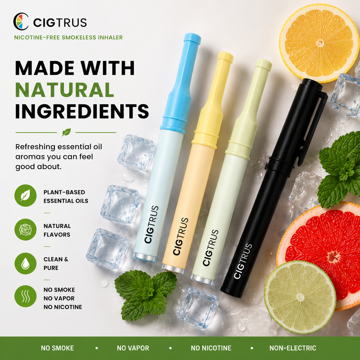
Cigtrus natural ingredients and essential oil aroma visual
UNDERSTAND THE PRODUCT

What Makes
Cigtrus Different

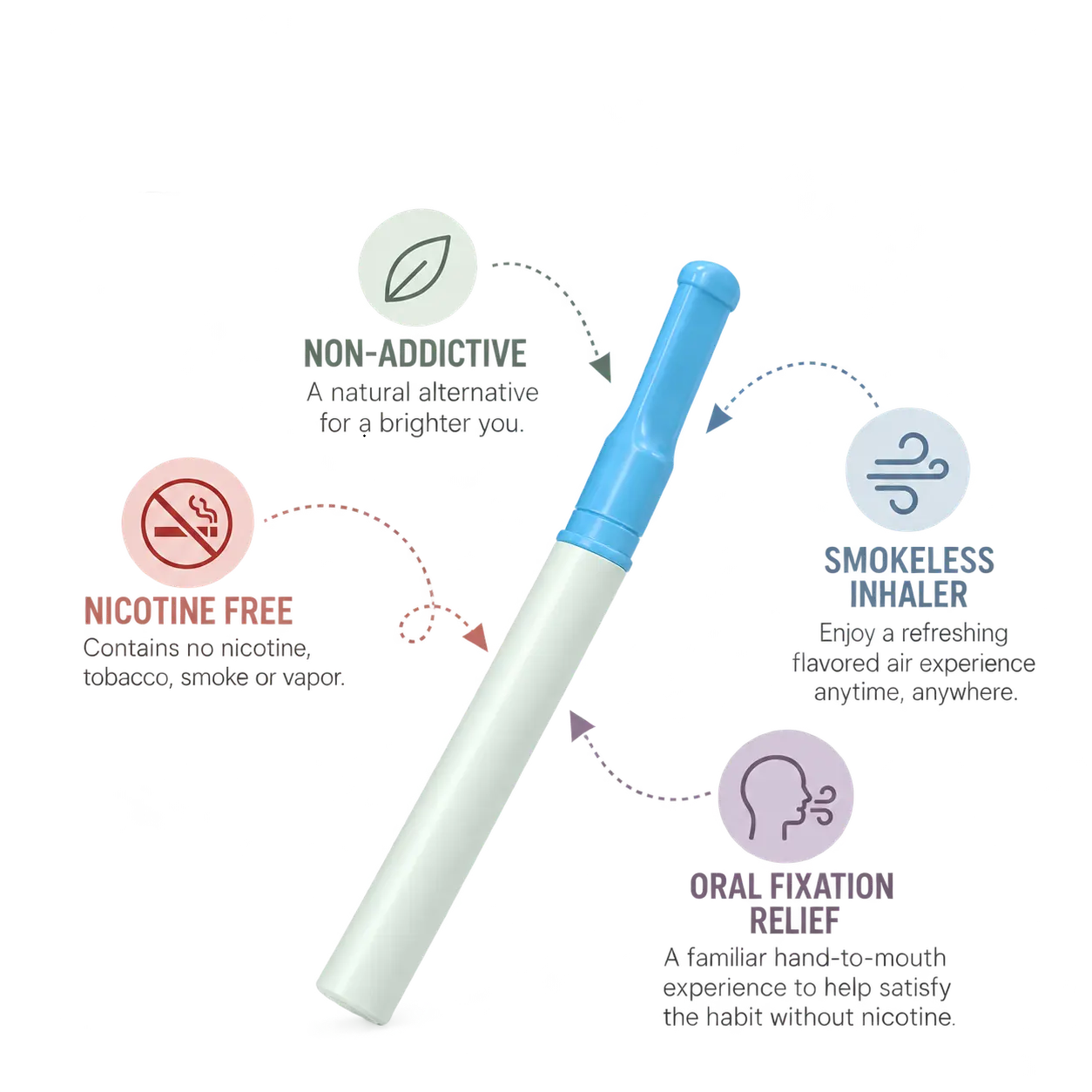
Two quick visuals help buyers understand the product at a glance — what goes into the Cigtrus experience and the key features customers recognize.

Nicotine-Free Tobacco-Free Smoke-Free Vapor-Free Non-Electric Essential Oil Aromas
Cigtrus smokeless inhaler features visual
:root{ --navy:#092d4c;--blue:#1777ad;--red:#d94b43;--green:#368c49;--yellow:#dda91f; --ink:#132b3e;--muted:#647482;--line:#d9e2e7;--paper:#fff;--wash:#f5f8fa; } *{box-sizing:border-box}html{scroll-behavior:smooth} body{margin:0;font-family:Arial,Helvetica,sans-serif;color:var(--ink);background:#fff;line-height:1.55} a{text-decoration:none;color:inherit}img{max-width:100%;display:block} .wrap{width:min(1160px,calc(100% - 48px));margin:auto} .preview{background:#092d4c;color:#fff;text-align:center;padding:9px 16px;font-size:12px;font-weight:700} .preview span{opacity:.7;font-weight:400} .kicker,.eyebrow{display:block;font-size:11px;font-weight:800;letter-spacing:.14em;text-transform:uppercase;color:var(--blue);margin-bottom:12px} h1,h2,h3,p{margin-top:0} h1{font-family:Georgia,"Times New Roman",serif;font-size:clamp(45px,5.6vw,72px);line-height:.98;letter-spacing:-.035em;color:var(--navy);font-weight:700;margin-bottom:24px} h1 span{display:block;color:var(--blue)} h2{font-family:Georgia,"Times New Roman",serif;font-size:clamp(31px,3.6vw,48px);line-height:1.04;letter-spacing:-.025em;color:var(--navy);font-weight:700;margin-bottom:15px} h3{font-size:19px;line-height:1.2;color:var(--navy);margin-bottom:9px} p{color:var(--muted)} .section-head{max-width:760px;margin:0 0 38px;text-align:left} .section-head p{font-size:16px;max-width:680px} .btn{display:inline-flex;align-items:center;justify-content:center;padding:13px 19px;font-size:14px;font-weight:800;border:1px solid transparent;transition:.18s} .btn:hover{transform:translateY(-1px)} .btn-blue{background:var(--blue);color:#fff}.btn-dark{background:var(--navy);color:#fff} .btn-outline{background:#fff;border-color:#9bb0bd;color:var(--navy)} .btn-apply{background:var(--red);color:#fff;border-color:var(--red)} .actions{display:flex;gap:10px;flex-wrap:wrap} /* 1 HERO — editorial split, no floating rounded card */ .hero{padding:74px 0 54px;background:#f3f8fb;border-bottom:1px solid var(--line)} .hero-grid{display:grid;grid-template-columns:.92fr 1.08fr;gap:46px;align-items:center} .hero-lead{font-size:18px;max-width:620px;margin-bottom:25px} .guide-link{display:inline-block;margin-top:15px;font-size:12px;font-weight:700;color:#526c7c;border-bottom:1px solid #b8c7cf;padding-bottom:2px} .pricing{font-size:12px;color:#7b8993;margin-top:12px} .hero-product{display:block;background:#fff;border-left:5px solid var(--red)} .hero-image{position:relative;min-height:455px;padding:10px 16px;display:flex;align-items:center;justify-content:center} .hero-image img{max-height:445px;max-width:96%;object-fit:contain}.hero-image.hero-retail{padding:0;overflow:hidden;background:#e8eef1}.hero-image.hero-retail img{width:100%;height:455px;max-width:none;max-height:none;object-fit:cover;object-position:center center} .badge{position:absolute;top:18px;left:18px;background:var(--navy);color:#fff;padding:7px 10px;font-size:10px;font-weight:800;letter-spacing:.08em} .hero-bar{background:#fff;border-top:1px solid var(--line);padding:18px 20px;display:grid;grid-template-columns:1fr auto;align-items:center;gap:18px;color:var(--navy)} .hero-bar small{display:block;font-size:10px;letter-spacing:.1em;color:#657681}.hero-bar strong{font-size:16px}.hero-bar a{align-self:center;white-space:nowrap;font-weight:800;color:var(--blue);border-bottom:1px solid #8fc3dd} .trust{display:grid;grid-template-columns:repeat(5,1fr);margin-top:32px;border-top:1px solid #cbd9e1;border-bottom:1px solid #cbd9e1} .trust div{padding:14px 9px;text-align:center;border-right:1px solid #cbd9e1}.trust div:last-child{border-right:0} .trust strong{display:block;font-size:19px;color:var(--navy)}.trust span{font-size:11px;color:#687985} .trust div:nth-child(1) strong{color:var(--red)}.trust div:nth-child(3) strong{color:var(--blue)}.trust div:nth-child(4) strong{color:var(--green)}.trust div:nth-child(5) strong{color:var(--yellow)} /* 2 PROGRAMS — flat catalog rows/cards */ .programs{padding:72px 0 78px;background:#fff}.programs .section-head{max-width:820px;margin:0 auto 42px;text-align:center}.programs .section-head p{margin-left:auto;margin-right:auto} .program-grid{display:grid;grid-template-columns:repeat(3,1fr);gap:0;border-top:1px solid var(--line);border-bottom:1px solid var(--line)} .card{display:block;padding:0 25px 28px;border-right:1px solid var(--line);background:#fff}.card:first-child{padding-left:0}.card:last-child{border-right:0;padding-right:0} .card-img{height:290px;display:flex;align-items:center;justify-content:center;padding:8px;position:relative;background:#f7f8f8;margin-bottom:20px} .card-img img{width:100%;height:100%;object-fit:contain;transform:scale(1.06)}.card-copy{padding:0} .card-copy p{font-size:14px;min-height:66px}.tags{display:none}.more{font-size:13px;font-weight:800;color:var(--blue);border-bottom:1px solid #9bc7df} /* 3 CORE — large photography and simple numbered process */ .core{padding:78px 0;background:#eef5f8} .core-grid{display:grid;grid-template-columns:.72fr 1.28fr;gap:42px;align-items:center} .core-copy>p{font-size:17px}.core-image{background:#fff}.core-image img{width:100%;height:500px;object-fit:cover} .core-visuals{display:grid;grid-template-columns:1.08fr .92fr;gap:14px;align-items:stretch} .core-visuals figure{margin:0;background:#fff;border:1px solid #d9e2e7} .lifestyle-figure img{width:100%;height:430px;object-fit:cover;object-position:center} .howto-figure{display:flex;flex-direction:column} .howto-figure img{width:100%;height:430px;object-fit:contain;background:#fff;padding:8px} .core-visuals figcaption{padding:13px 15px;font-size:12px;line-height:1.45;color:#5a6e7c;border-top:1px solid #e2e8eb} .core-visuals figcaption strong{color:#092d4c;font-size:13px} .steps{margin:27px 0;border-top:1px solid #bfcfd8} .step{display:grid;grid-template-columns:44px 1fr;align-items:center;padding:12px 0;border-bottom:1px solid #bfcfd8} .step b{font-size:12px;color:var(--red)}.step strong{font-size:13px;color:var(--navy)} .pills{display:flex;gap:16px;flex-wrap:wrap}.pills span{font-size:11px;font-weight:800;color:#3d5869} /* 4 FAMILIES — product catalog, square photography */ .families{padding:78px 0} .family-grid{display:grid;grid-template-columns:repeat(4,1fr);gap:24px} .family{display:block;border-top:4px solid var(--blue);padding-top:0} .family:nth-child(1){border-image:linear-gradient(90deg,var(--red),var(--blue),var(--green),var(--yellow)) 1} .family:nth-child(2){border-color:var(--green)}.family:nth-child(3){border-color:var(--blue)}.family:nth-child(4){border-color:var(--red)} .family-img{height:250px;background:#f5f6f6;margin-bottom:16px}.family-img img{width:100%;height:100%;object-fit:contain} .family-copy{padding:0}.family-copy p{font-size:13px;min-height:52px}.family-copy strong{font-size:12px;color:var(--blue);border-bottom:1px solid #9bc7df} /* 5 STORES — simple directory, less icon-card UI */ .stores{padding:76px 0;background:#f7f8f8;border-top:1px solid #e5eaed;border-bottom:1px solid #e5eaed} .store-layout{display:grid;grid-template-columns:1fr 280px;gap:38px} .store-grid{display:grid;grid-template-columns:repeat(2,1fr);border-top:1px solid var(--line)} .store{padding:18px 20px 18px 0;border-bottom:1px solid var(--line);min-height:112px} .store:nth-child(odd){border-right:1px solid var(--line)}.store:nth-child(even){padding-left:20px} .store-icon{font-size:23px;margin-bottom:7px}.store h3{font-size:16px}.store p{font-size:12px;margin:0} .guide-box{background:var(--navy);color:#fff;padding:30px 26px;display:flex;flex-direction:column;justify-content:center} .guide-box h3{color:#fff;font-family:Georgia,"Times New Roman",serif;font-size:25px}.guide-box p{color:#d1dde5;font-size:13px}.guide-box .pin{font-size:30px;margin-bottom:10px} /* 6 WHY — strong business strip, flatter benefit columns */ .why{padding:72px 0;background:#135a87;color:#fff} .why .section-head{margin-bottom:30px}.why .kicker{color:#d6efff}.why h2{color:#fff}.why .section-head p{color:#e2edf4} .why-grid{display:grid;grid-template-columns:repeat(4,1fr);border-top:1px solid rgba(255,255,255,.35)} .why-card{padding:27px 25px 10px 0;border-right:1px solid rgba(255,255,255,.28);min-height:210px} .why-card+ .why-card{padding-left:25px}.why-card:last-child{border-right:0} .why-big{font-family:Georgia,"Times New Roman",serif;font-size:49px;font-weight:700;line-height:1;color:#fff;margin-bottom:13px} .why-label{font-size:10px;font-weight:800;letter-spacing:.13em;color:#cfe8f7;margin-bottom:8px} .why-card h3{color:#fff;font-size:18px}.why-card p{color:#dce9f1;font-size:13px;margin-bottom:0} .why-symbol{width:38px;height:38px;display:flex;align-items:center;justify-content:center;font-size:23px;font-weight:800;margin-bottom:15px;color:#fff} .margin .why-big{color:#ffdad6}.demand .why-symbol{color:#cfefff}.wellness .why-symbol{color:#c9efcf}.nrt .why-symbol{color:#ffd0cc} /* 7 ACCOUNT — keep popup URLs/classes from approved V7 */ .partner{padding:76px 0;background:#fff} .partner-card{border-top:5px solid var(--navy);border-bottom:1px solid var(--line)} .partner-top{display:grid;grid-template-columns:.95fr 1.05fr;gap:50px;padding:38px 0} .partner-copy{padding:0}.partner-copy h2{font-size:clamp(35px,3.5vw,49px)}.partner-copy h2 .pricing-pop{color:var(--red)}.partner-copy p{font-size:15px} .benefits{display:grid;grid-template-columns:1fr 1fr;gap:10px;margin-top:20px}.benefits span{font-size:12px;font-weight:700;color:#435f70} .access{display:grid;grid-template-columns:1fr 1fr;border:1px solid var(--line)} .access-box{padding:28px;display:flex;flex-direction:column;min-height:255px;background:#fff} .access-box:first-child{border-right:1px solid var(--line);border-top:4px solid var(--red)} .access-box:last-child{border-top:4px solid var(--navy)} .access-box small{font-size:10px;font-weight:800;letter-spacing:.09em;color:#6a7d89}.access-box h3{font-size:20px;margin-top:10px} .access-box:first-child h3{color:var(--red)}.access-box p{font-size:12px;margin-bottom:18px}.access-box .btn{margin-top:auto;width:100%} .contact{border-top:1px solid var(--line);padding:16px 0;display:flex;gap:28px;flex-wrap:wrap;font-size:12px;font-weight:700;color:#365469} @media(max-width:900px){ .hero-grid,.core-grid,.partner-top{grid-template-columns:1fr}.core-visuals{grid-template-columns:1fr 1fr}.program-grid{grid-template-columns:1fr 1fr}.card:nth-child(2){border-right:0}.card:nth-child(3){margin-top:30px} .family-grid{grid-template-columns:1fr 1fr}.store-layout{grid-template-columns:1fr}.why-grid{grid-template-columns:1fr 1fr}.why-card:nth-child(2){border-right:0} } @media(max-width:620px){ .wrap{width:min(100% - 28px,1160px)}.hero,.programs,.core,.families,.stores,.why,.partner{padding:50px 0} h1{font-size:43px}h2{font-size:32px}.actions .btn{width:100%}.trust{grid-template-columns:repeat(2,1fr)}.trust div{border-bottom:1px solid #cbd9e1}.trust div:last-child{grid-column:1/-1} .program-grid,.family-grid,.store-grid,.why-grid,.access{grid-template-columns:1fr}.card,.card:first-child,.card:last-child{padding:0 0 26px;border-right:0}.card+ .card{margin-top:28px} .core-image img{height:auto}.core-visuals{grid-template-columns:1fr}.lifestyle-figure img,.howto-figure img{height:auto;max-height:none}.hero-image{min-height:360px}.hero-image img{max-height:350px}.hero-image.hero-retail img{height:360px;max-height:none}.card-img{height:250px}.store:nth-child(odd){border-right:0}.store:nth-child(even){padding-left:0}.why-card,.why-card+ .why-card{padding:22px 0;border-right:0;border-bottom:1px solid rgba(255,255,255,.25)} .partner-top{gap:25px}.access-box:first-child{border-right:0;border-bottom:1px solid var(--line)}.benefits{grid-template-columns:1fr} } .hero-image.hero-retail{padding:0;background:#fff;overflow:hidden;display:flex;align-items:center;justify-content:center} .hero-image.hero-retail img{width:100%;height:auto;max-width:100%;max-height:none;object-fit:contain;object-position:center} .product-story{padding:68px 0 74px;background:#fff} .product-story .story-head{max-width:760px;margin:0 auto 30px;text-align:center} .product-story .eyebrow{font-size:10px;font-weight:800;letter-spacing:.15em;color:#0b7fa3} .product-story h2{font-family:Georgia,'Times New Roman',serif;font-size:38px;line-height:1.08;color:#092d4c;margin:10px 0 10px} .product-story p{font-size:14px;color:#5a6e7c;margin:0} .story-visual{max-width:1040px;margin:0 auto;background:#fff} .story-visual img{display:block;width:100%;height:auto;object-fit:contain} @media(max-width:760px){.product-story{padding:48px 0}.product-story h2{font-size:30px}} /* V8.5 compact product-story override */ .product-story{padding:62px 0;background:#fff} .product-story .story-row{display:grid;grid-template-columns:.72fr 1.28fr;gap:46px;align-items:center;max-width:1100px;margin:0 auto} .product-story .story-copy{text-align:left} .product-story .story-copy .eyebrow{font-size:10px;font-weight:800;letter-spacing:.15em;color:#0b7fa3} .product-story .story-copy h2{font-family:Georgia,'Times New Roman',serif;font-size:38px;line-height:1.08;color:#092d4c;margin:10px 0 14px} .product-story .story-copy p{font-size:14px;line-height:1.65;color:#5a6e7c;margin:0 0 20px} .product-story .story-points{display:flex;flex-wrap:wrap;gap:8px 16px;padding-top:15px;border-top:1px solid #d7e1e6} .product-story .story-points span{font-size:11px;font-weight:800;color:#173b55} .product-story .story-visual{max-width:none;margin:0;background:#fff;display:flex;align-items:center;justify-content:center} .product-story .story-visual img{display:block;width:100%;height:410px;object-fit:contain} @media(max-width:900px){ .product-story .story-row{grid-template-columns:1fr;gap:25px} .product-story .story-copy{text-align:center} .product-story .story-points{justify-content:center} .product-story .story-visual img{height:auto;max-height:520px} } /* V8.6 — fuller desktop editorial layout */ @media(min-width:1100px){ .wrap{max-width:1280px} .hero .wrap{max-width:1280px} .hero-grid{grid-template-columns:.88fr 1.12fr;gap:54px} .hero-copy h1{font-size:64px;line-height:.95} .hero-copy>p{font-size:17px;line-height:1.55;max-width:590px} .hero-image.hero-retail img{width:100%;max-height:560px;object-fit:contain} .programs .wrap,.core .wrap,.families .wrap,.stores .wrap,.why .wrap,.partner .wrap{max-width:1280px} .program-grid{gap:0} .program-card img{width:100%} .core-grid{grid-template-columns:.76fr 1.24fr;gap:52px} .core-copy h2{font-size:48px} .core-copy>p{font-size:16px;line-height:1.55} .core-visuals{grid-template-columns:1.08fr .92fr;gap:18px} .product-story .story-row{max-width:1280px;grid-template-columns:.82fr 1.18fr;gap:58px} .product-story .story-copy h2{font-size:46px} .product-story .story-copy p{font-size:16px;max-width:520px} .product-story .story-visual img{height:500px} .families-grid,.store-grid{width:100%} .why-grid{width:100%} .partner-grid{width:100%} } @media(min-width:1450px){ .wrap,.hero .wrap,.programs .wrap,.core .wrap,.families .wrap,.stores .wrap,.why .wrap,.partner .wrap{max-width:1320px} } /* ================= V9 FINAL REFINEMENTS ================= */ .product-story{padding:68px 0;background:#fff} .product-story .story-three{ display:grid; grid-template-columns:1fr .82fr 1fr; gap:34px; align-items:center; max-width:1320px; margin:0 auto } .product-story .story-side{ min-width:0; display:flex; align-items:center; justify-content:center } .product-story .story-side img{ display:block; width:100%; height:430px; object-fit:contain; background:#fff } .product-story .story-center{text-align:center;padding:0 8px} .product-story .story-center .eyebrow{ font-size:10px;font-weight:800;letter-spacing:.15em;color:#0b7fa3 } .product-story .story-center h2{ font-family:Georgia,'Times New Roman',serif; color:#092d4c;font-size:42px;line-height:1.03;margin:10px 0 16px } .product-story .story-center p{ font-size:14px;line-height:1.65;color:#5a6e7c;margin:0 auto 22px;max-width:390px } .product-story .story-points{ display:grid;grid-template-columns:1fr 1fr;gap:0 16px; border-top:1px solid #d7e1e6 } .product-story .story-points span{ font-size:11px;font-weight:800;color:#173b55; padding:10px 0;border-bottom:1px solid #d7e1e6 } /* Keep V8.6's imagery-rich sections intact and give images room to read */ @media(min-width:1100px){ .programs .card-img{height:260px} .programs .card-img img{max-height:245px} .core-visuals{grid-template-columns:1.08fr .92fr} .core-visuals figure img{min-height:390px} .family-img{height:245px} .family-img img{max-height:230px} } @media(max-width:1000px){ .product-story .story-three{grid-template-columns:1fr 1fr} .product-story .story-center{grid-column:1 / -1;grid-row:1} .product-story .story-left{grid-column:1;grid-row:2} .product-story .story-right{grid-column:2;grid-row:2} .product-story .story-side img{height:390px} } @media(max-width:650px){ .product-story .story-three{grid-template-columns:1fr} .product-story .story-center,.product-story .story-left,.product-story .story-right{grid-column:1;grid-row:auto} .product-story .story-side img{height:auto;max-height:470px} } /* ========================================================= CIGTRUS V9 FINAL WIDE — GLOBAL LAYOUT ONLY Approved V9.1 design, widened for desktop. ========================================================= */ @media (min-width:1201px){ .wrap, .hero .wrap, .programs .wrap, .core .wrap, .families .wrap, .stores .wrap, .why .wrap, .partner .wrap{ width:calc(100% - 64px)!important; max-width:1460px!important; padding-left:0!important; padding-right:0!important; } .product-story .story-row{ width:calc(100% - 64px)!important; max-width:1460px!important; } } /* Remove unintended hero divider/accent line after widening. */ @media (min-width:901px){ .hero-copy, .hero-copy:before, .hero-copy:after, .hero-grid > div:first-child{ border-left:0!important; border-right:0!important; } .hero-copy:before, .hero-copy:after{content:none!important} } /* Preserve comfortable tablet/mobile gutters. */ @media (max-width:1200px){ .wrap, .hero .wrap, .programs .wrap, .core .wrap, .families .wrap, .stores .wrap, .why .wrap, .partner .wrap{width:calc(100% - 40px)!important} } @media (max-width:650px){ .wrap, .hero .wrap, .programs .wrap, .core .wrap, .families .wrap, .stores .wrap, .why .wrap, .partner .wrap{width:calc(100% - 30px)!important} }
WHERE CIGTRUS FITS

What Kind of Store Do You Operate?

Different Cigtrus products fit different retail environments. Find your store type and see the assortment that makes sense.

⛽

Convenience & Gas

80 Count Display • Refills • Compact Packs • O2

Rx

Pharmacy

Core Cigtrus • Mullein Leaf • Peg/Shelf • O2

🌿

Health & Wellness

Mullein Leaf • Variety Packs • Core Cigtrus

✈

Travel Retail

EZFLY • Variety Packs • Compact Formats

◉

Smoke & Vape Shops

80 Count • Refills • Compact Packs • O2

✦

Specialty Retail

Build an assortment around your customer and available space.

📍

Retail Placement & Sales Guide

See how Cigtrus fits into real retail environments.

View Placement Guide →
:root{ --navy:#092d4c;--blue:#1777ad;--red:#d94b43;--green:#368c49;--yellow:#dda91f; --ink:#132b3e;--muted:#647482;--line:#d9e2e7;--paper:#fff;--wash:#f5f8fa; } *{box-sizing:border-box}html{scroll-behavior:smooth} body{margin:0;font-family:Arial,Helvetica,sans-serif;color:var(--ink);background:#fff;line-height:1.55} a{text-decoration:none;color:inherit}img{max-width:100%;display:block} .wrap{width:min(1160px,calc(100% - 48px));margin:auto} .preview{background:#092d4c;color:#fff;text-align:center;padding:9px 16px;font-size:12px;font-weight:700} .preview span{opacity:.7;font-weight:400} .kicker,.eyebrow{display:block;font-size:11px;font-weight:800;letter-spacing:.14em;text-transform:uppercase;color:var(--blue);margin-bottom:12px} h1,h2,h3,p{margin-top:0} h1{font-family:Georgia,"Times New Roman",serif;font-size:clamp(45px,5.6vw,72px);line-height:.98;letter-spacing:-.035em;color:var(--navy);font-weight:700;margin-bottom:24px} h1 span{display:block;color:var(--blue)} h2{font-family:Georgia,"Times New Roman",serif;font-size:clamp(31px,3.6vw,48px);line-height:1.04;letter-spacing:-.025em;color:var(--navy);font-weight:700;margin-bottom:15px} h3{font-size:19px;line-height:1.2;color:var(--navy);margin-bottom:9px} p{color:var(--muted)} .section-head{max-width:760px;margin:0 0 38px;text-align:left} .section-head p{font-size:16px;max-width:680px} .btn{display:inline-flex;align-items:center;justify-content:center;padding:13px 19px;font-size:14px;font-weight:800;border:1px solid transparent;transition:.18s} .btn:hover{transform:translateY(-1px)} .btn-blue{background:var(--blue);color:#fff}.btn-dark{background:var(--navy);color:#fff} .btn-outline{background:#fff;border-color:#9bb0bd;color:var(--navy)} .btn-apply{background:var(--red);color:#fff;border-color:var(--red)} .actions{display:flex;gap:10px;flex-wrap:wrap} /* 1 HERO — editorial split, no floating rounded card */ .hero{padding:74px 0 54px;background:#f3f8fb;border-bottom:1px solid var(--line)} .hero-grid{display:grid;grid-template-columns:.92fr 1.08fr;gap:46px;align-items:center} .hero-lead{font-size:18px;max-width:620px;margin-bottom:25px} .guide-link{display:inline-block;margin-top:15px;font-size:12px;font-weight:700;color:#526c7c;border-bottom:1px solid #b8c7cf;padding-bottom:2px} .pricing{font-size:12px;color:#7b8993;margin-top:12px} .hero-product{display:block;background:#fff;border-left:5px solid var(--red)} .hero-image{position:relative;min-height:455px;padding:10px 16px;display:flex;align-items:center;justify-content:center} .hero-image img{max-height:445px;max-width:96%;object-fit:contain}.hero-image.hero-retail{padding:0;overflow:hidden;background:#e8eef1}.hero-image.hero-retail img{width:100%;height:455px;max-width:none;max-height:none;object-fit:cover;object-position:center center} .badge{position:absolute;top:18px;left:18px;background:var(--navy);color:#fff;padding:7px 10px;font-size:10px;font-weight:800;letter-spacing:.08em} .hero-bar{background:#fff;border-top:1px solid var(--line);padding:18px 20px;display:grid;grid-template-columns:1fr auto;align-items:center;gap:18px;color:var(--navy)} .hero-bar small{display:block;font-size:10px;letter-spacing:.1em;color:#657681}.hero-bar strong{font-size:16px}.hero-bar a{align-self:center;white-space:nowrap;font-weight:800;color:var(--blue);border-bottom:1px solid #8fc3dd} .trust{display:grid;grid-template-columns:repeat(5,1fr);margin-top:32px;border-top:1px solid #cbd9e1;border-bottom:1px solid #cbd9e1} .trust div{padding:14px 9px;text-align:center;border-right:1px solid #cbd9e1}.trust div:last-child{border-right:0} .trust strong{display:block;font-size:19px;color:var(--navy)}.trust span{font-size:11px;color:#687985} .trust div:nth-child(1) strong{color:var(--red)}.trust div:nth-child(3) strong{color:var(--blue)}.trust div:nth-child(4) strong{color:var(--green)}.trust div:nth-child(5) strong{color:var(--yellow)} /* 2 PROGRAMS — flat catalog rows/cards */ .programs{padding:72px 0 78px;background:#fff}.programs .section-head{max-width:820px;margin:0 auto 42px;text-align:center}.programs .section-head p{margin-left:auto;margin-right:auto} .program-grid{display:grid;grid-template-columns:repeat(3,1fr);gap:0;border-top:1px solid var(--line);border-bottom:1px solid var(--line)} .card{display:block;padding:0 25px 28px;border-right:1px solid var(--line);background:#fff}.card:first-child{padding-left:0}.card:last-child{border-right:0;padding-right:0} .card-img{height:290px;display:flex;align-items:center;justify-content:center;padding:8px;position:relative;background:#f7f8f8;margin-bottom:20px} .card-img img{width:100%;height:100%;object-fit:contain;transform:scale(1.06)}.card-copy{padding:0} .card-copy p{font-size:14px;min-height:66px}.tags{display:none}.more{font-size:13px;font-weight:800;color:var(--blue);border-bottom:1px solid #9bc7df} /* 3 CORE — large photography and simple numbered process */ .core{padding:78px 0;background:#eef5f8} .core-grid{display:grid;grid-template-columns:.72fr 1.28fr;gap:42px;align-items:center} .core-copy>p{font-size:17px}.core-image{background:#fff}.core-image img{width:100%;height:500px;object-fit:cover} .core-visuals{display:grid;grid-template-columns:1.08fr .92fr;gap:14px;align-items:stretch} .core-visuals figure{margin:0;background:#fff;border:1px solid #d9e2e7} .lifestyle-figure img{width:100%;height:430px;object-fit:cover;object-position:center} .howto-figure{display:flex;flex-direction:column} .howto-figure img{width:100%;height:430px;object-fit:contain;background:#fff;padding:8px} .core-visuals figcaption{padding:13px 15px;font-size:12px;line-height:1.45;color:#5a6e7c;border-top:1px solid #e2e8eb} .core-visuals figcaption strong{color:#092d4c;font-size:13px} .steps{margin:27px 0;border-top:1px solid #bfcfd8} .step{display:grid;grid-template-columns:44px 1fr;align-items:center;padding:12px 0;border-bottom:1px solid #bfcfd8} .step b{font-size:12px;color:var(--red)}.step strong{font-size:13px;color:var(--navy)} .pills{display:flex;gap:16px;flex-wrap:wrap}.pills span{font-size:11px;font-weight:800;color:#3d5869} /* 4 FAMILIES — product catalog, square photography */ .families{padding:78px 0} .family-grid{display:grid;grid-template-columns:repeat(4,1fr);gap:24px} .family{display:block;border-top:4px solid var(--blue);padding-top:0} .family:nth-child(1){border-image:linear-gradient(90deg,var(--red),var(--blue),var(--green),var(--yellow)) 1} .family:nth-child(2){border-color:var(--green)}.family:nth-child(3){border-color:var(--blue)}.family:nth-child(4){border-color:var(--red)} .family-img{height:250px;background:#f5f6f6;margin-bottom:16px}.family-img img{width:100%;height:100%;object-fit:contain} .family-copy{padding:0}.family-copy p{font-size:13px;min-height:52px}.family-copy strong{font-size:12px;color:var(--blue);border-bottom:1px solid #9bc7df} /* 5 STORES — simple directory, less icon-card UI */ .stores{padding:76px 0;background:#f7f8f8;border-top:1px solid #e5eaed;border-bottom:1px solid #e5eaed} .store-layout{display:grid;grid-template-columns:1fr 280px;gap:38px} .store-grid{display:grid;grid-template-columns:repeat(2,1fr);border-top:1px solid var(--line)} .store{padding:18px 20px 18px 0;border-bottom:1px solid var(--line);min-height:112px} .store:nth-child(odd){border-right:1px solid var(--line)}.store:nth-child(even){padding-left:20px} .store-icon{font-size:23px;margin-bottom:7px}.store h3{font-size:16px}.store p{font-size:12px;margin:0} .guide-box{background:var(--navy);color:#fff;padding:30px 26px;display:flex;flex-direction:column;justify-content:center} .guide-box h3{color:#fff;font-family:Georgia,"Times New Roman",serif;font-size:25px}.guide-box p{color:#d1dde5;font-size:13px}.guide-box .pin{font-size:30px;margin-bottom:10px} /* 6 WHY — strong business strip, flatter benefit columns */ .why{padding:72px 0;background:#135a87;color:#fff} .why .section-head{margin-bottom:30px}.why .kicker{color:#d6efff}.why h2{color:#fff}.why .section-head p{color:#e2edf4} .why-grid{display:grid;grid-template-columns:repeat(4,1fr);border-top:1px solid rgba(255,255,255,.35)} .why-card{padding:27px 25px 10px 0;border-right:1px solid rgba(255,255,255,.28);min-height:210px} .why-card+ .why-card{padding-left:25px}.why-card:last-child{border-right:0} .why-big{font-family:Georgia,"Times New Roman",serif;font-size:49px;font-weight:700;line-height:1;color:#fff;margin-bottom:13px} .why-label{font-size:10px;font-weight:800;letter-spacing:.13em;color:#cfe8f7;margin-bottom:8px} .why-card h3{color:#fff;font-size:18px}.why-card p{color:#dce9f1;font-size:13px;margin-bottom:0} .why-symbol{width:38px;height:38px;display:flex;align-items:center;justify-content:center;font-size:23px;font-weight:800;margin-bottom:15px;color:#fff} .margin .why-big{color:#ffdad6}.demand .why-symbol{color:#cfefff}.wellness .why-symbol{color:#c9efcf}.nrt .why-symbol{color:#ffd0cc} /* 7 ACCOUNT — keep popup URLs/classes from approved V7 */ .partner{padding:76px 0;background:#fff} .partner-card{border-top:5px solid var(--navy);border-bottom:1px solid var(--line)} .partner-top{display:grid;grid-template-columns:.95fr 1.05fr;gap:50px;padding:38px 0} .partner-copy{padding:0}.partner-copy h2{font-size:clamp(35px,3.5vw,49px)}.partner-copy h2 .pricing-pop{color:var(--red)}.partner-copy p{font-size:15px} .benefits{display:grid;grid-template-columns:1fr 1fr;gap:10px;margin-top:20px}.benefits span{font-size:12px;font-weight:700;color:#435f70} .access{display:grid;grid-template-columns:1fr 1fr;border:1px solid var(--line)} .access-box{padding:28px;display:flex;flex-direction:column;min-height:255px;background:#fff} .access-box:first-child{border-right:1px solid var(--line);border-top:4px solid var(--red)} .access-box:last-child{border-top:4px solid var(--navy)} .access-box small{font-size:10px;font-weight:800;letter-spacing:.09em;color:#6a7d89}.access-box h3{font-size:20px;margin-top:10px} .access-box:first-child h3{color:var(--red)}.access-box p{font-size:12px;margin-bottom:18px}.access-box .btn{margin-top:auto;width:100%} .contact{border-top:1px solid var(--line);padding:16px 0;display:flex;gap:28px;flex-wrap:wrap;font-size:12px;font-weight:700;color:#365469} @media(max-width:900px){ .hero-grid,.core-grid,.partner-top{grid-template-columns:1fr}.core-visuals{grid-template-columns:1fr 1fr}.program-grid{grid-template-columns:1fr 1fr}.card:nth-child(2){border-right:0}.card:nth-child(3){margin-top:30px} .family-grid{grid-template-columns:1fr 1fr}.store-layout{grid-template-columns:1fr}.why-grid{grid-template-columns:1fr 1fr}.why-card:nth-child(2){border-right:0} } @media(max-width:620px){ .wrap{width:min(100% - 28px,1160px)}.hero,.programs,.core,.families,.stores,.why,.partner{padding:50px 0} h1{font-size:43px}h2{font-size:32px}.actions .btn{width:100%}.trust{grid-template-columns:repeat(2,1fr)}.trust div{border-bottom:1px solid #cbd9e1}.trust div:last-child{grid-column:1/-1} .program-grid,.family-grid,.store-grid,.why-grid,.access{grid-template-columns:1fr}.card,.card:first-child,.card:last-child{padding:0 0 26px;border-right:0}.card+ .card{margin-top:28px} .core-image img{height:auto}.core-visuals{grid-template-columns:1fr}.lifestyle-figure img,.howto-figure img{height:auto;max-height:none}.hero-image{min-height:360px}.hero-image img{max-height:350px}.hero-image.hero-retail img{height:360px;max-height:none}.card-img{height:250px}.store:nth-child(odd){border-right:0}.store:nth-child(even){padding-left:0}.why-card,.why-card+ .why-card{padding:22px 0;border-right:0;border-bottom:1px solid rgba(255,255,255,.25)} .partner-top{gap:25px}.access-box:first-child{border-right:0;border-bottom:1px solid var(--line)}.benefits{grid-template-columns:1fr} } .hero-image.hero-retail{padding:0;background:#fff;overflow:hidden;display:flex;align-items:center;justify-content:center} .hero-image.hero-retail img{width:100%;height:auto;max-width:100%;max-height:none;object-fit:contain;object-position:center} .product-story{padding:68px 0 74px;background:#fff} .product-story .story-head{max-width:760px;margin:0 auto 30px;text-align:center} .product-story .eyebrow{font-size:10px;font-weight:800;letter-spacing:.15em;color:#0b7fa3} .product-story h2{font-family:Georgia,'Times New Roman',serif;font-size:38px;line-height:1.08;color:#092d4c;margin:10px 0 10px} .product-story p{font-size:14px;color:#5a6e7c;margin:0} .story-visual{max-width:1040px;margin:0 auto;background:#fff} .story-visual img{display:block;width:100%;height:auto;object-fit:contain} @media(max-width:760px){.product-story{padding:48px 0}.product-story h2{font-size:30px}} /* V8.5 compact product-story override */ .product-story{padding:62px 0;background:#fff} .product-story .story-row{display:grid;grid-template-columns:.72fr 1.28fr;gap:46px;align-items:center;max-width:1100px;margin:0 auto} .product-story .story-copy{text-align:left} .product-story .story-copy .eyebrow{font-size:10px;font-weight:800;letter-spacing:.15em;color:#0b7fa3} .product-story .story-copy h2{font-family:Georgia,'Times New Roman',serif;font-size:38px;line-height:1.08;color:#092d4c;margin:10px 0 14px} .product-story .story-copy p{font-size:14px;line-height:1.65;color:#5a6e7c;margin:0 0 20px} .product-story .story-points{display:flex;flex-wrap:wrap;gap:8px 16px;padding-top:15px;border-top:1px solid #d7e1e6} .product-story .story-points span{font-size:11px;font-weight:800;color:#173b55} .product-story .story-visual{max-width:none;margin:0;background:#fff;display:flex;align-items:center;justify-content:center} .product-story .story-visual img{display:block;width:100%;height:410px;object-fit:contain} @media(max-width:900px){ .product-story .story-row{grid-template-columns:1fr;gap:25px} .product-story .story-copy{text-align:center} .product-story .story-points{justify-content:center} .product-story .story-visual img{height:auto;max-height:520px} } /* V8.6 — fuller desktop editorial layout */ @media(min-width:1100px){ .wrap{max-width:1280px} .hero .wrap{max-width:1280px} .hero-grid{grid-template-columns:.88fr 1.12fr;gap:54px} .hero-copy h1{font-size:64px;line-height:.95} .hero-copy>p{font-size:17px;line-height:1.55;max-width:590px} .hero-image.hero-retail img{width:100%;max-height:560px;object-fit:contain} .programs .wrap,.core .wrap,.families .wrap,.stores .wrap,.why .wrap,.partner .wrap{max-width:1280px} .program-grid{gap:0} .program-card img{width:100%} .core-grid{grid-template-columns:.76fr 1.24fr;gap:52px} .core-copy h2{font-size:48px} .core-copy>p{font-size:16px;line-height:1.55} .core-visuals{grid-template-columns:1.08fr .92fr;gap:18px} .product-story .story-row{max-width:1280px;grid-template-columns:.82fr 1.18fr;gap:58px} .product-story .story-copy h2{font-size:46px} .product-story .story-copy p{font-size:16px;max-width:520px} .product-story .story-visual img{height:500px} .families-grid,.store-grid{width:100%} .why-grid{width:100%} .partner-grid{width:100%} } @media(min-width:1450px){ .wrap,.hero .wrap,.programs .wrap,.core .wrap,.families .wrap,.stores .wrap,.why .wrap,.partner .wrap{max-width:1320px} } /* ================= V9 FINAL REFINEMENTS ================= */ .product-story{padding:68px 0;background:#fff} .product-story .story-three{ display:grid; grid-template-columns:1fr .82fr 1fr; gap:34px; align-items:center; max-width:1320px; margin:0 auto } .product-story .story-side{ min-width:0; display:flex; align-items:center; justify-content:center } .product-story .story-side img{ display:block; width:100%; height:430px; object-fit:contain; background:#fff } .product-story .story-center{text-align:center;padding:0 8px} .product-story .story-center .eyebrow{ font-size:10px;font-weight:800;letter-spacing:.15em;color:#0b7fa3 } .product-story .story-center h2{ font-family:Georgia,'Times New Roman',serif; color:#092d4c;font-size:42px;line-height:1.03;margin:10px 0 16px } .product-story .story-center p{ font-size:14px;line-height:1.65;color:#5a6e7c;margin:0 auto 22px;max-width:390px } .product-story .story-points{ display:grid;grid-template-columns:1fr 1fr;gap:0 16px; border-top:1px solid #d7e1e6 } .product-story .story-points span{ font-size:11px;font-weight:800;color:#173b55; padding:10px 0;border-bottom:1px solid #d7e1e6 } /* Keep V8.6's imagery-rich sections intact and give images room to read */ @media(min-width:1100px){ .programs .card-img{height:260px} .programs .card-img img{max-height:245px} .core-visuals{grid-template-columns:1.08fr .92fr} .core-visuals figure img{min-height:390px} .family-img{height:245px} .family-img img{max-height:230px} } @media(max-width:1000px){ .product-story .story-three{grid-template-columns:1fr 1fr} .product-story .story-center{grid-column:1 / -1;grid-row:1} .product-story .story-left{grid-column:1;grid-row:2} .product-story .story-right{grid-column:2;grid-row:2} .product-story .story-side img{height:390px} } @media(max-width:650px){ .product-story .story-three{grid-template-columns:1fr} .product-story .story-center,.product-story .story-left,.product-story .story-right{grid-column:1;grid-row:auto} .product-story .story-side img{height:auto;max-height:470px} } /* ========================================================= CIGTRUS V9 FINAL WIDE — GLOBAL LAYOUT ONLY Approved V9.1 design, widened for desktop. ========================================================= */ @media (min-width:1201px){ .wrap, .hero .wrap, .programs .wrap, .core .wrap, .families .wrap, .stores .wrap, .why .wrap, .partner .wrap{ width:calc(100% - 64px)!important; max-width:1460px!important; padding-left:0!important; padding-right:0!important; } .product-story .story-row{ width:calc(100% - 64px)!important; max-width:1460px!important; } } /* Remove unintended hero divider/accent line after widening. */ @media (min-width:901px){ .hero-copy, .hero-copy:before, .hero-copy:after, .hero-grid > div:first-child{ border-left:0!important; border-right:0!important; } .hero-copy:before, .hero-copy:after{content:none!important} } /* Preserve comfortable tablet/mobile gutters. */ @media (max-width:1200px){ .wrap, .hero .wrap, .programs .wrap, .core .wrap, .families .wrap, .stores .wrap, .why .wrap, .partner .wrap{width:calc(100% - 40px)!important} } @media (max-width:650px){ .wrap, .hero .wrap, .programs .wrap, .core .wrap, .families .wrap, .stores .wrap, .why .wrap, .partner .wrap{width:calc(100% - 30px)!important} }
WHY CIGTRUS

Why Retailers Carry Cigtrus

More than another product on the shelf — Cigtrus gives retailers a strong-margin, nicotine-free option that can complement categories customers already shop.

50%+
RETAIL MARGIN

Strong Margin. Small Footprint.

Strong retail margin potential from a compact product that requires very little selling space.

CUSTOMER DEMAND

Meet Customer Demand

Give customers looking for nicotine-free, tobacco-free and smokeless alternatives another option.

🌿
NATURAL & WELLNESS

Expand Your Assortment

Essential oil aroma products can complement natural, wellness and alternative-product sections.

+
NRT & ALTERNATIVES

Complements Existing Categories

A nicotine-free hand-to-mouth option that can merchandise alongside NRT and smoking-alternative categories.

:root{ --navy:#092d4c;--blue:#1777ad;--red:#d94b43;--green:#368c49;--yellow:#dda91f; --ink:#132b3e;--muted:#647482;--line:#d9e2e7;--paper:#fff;--wash:#f5f8fa; } *{box-sizing:border-box}html{scroll-behavior:smooth} body{margin:0;font-family:Arial,Helvetica,sans-serif;color:var(--ink);background:#fff;line-height:1.55} a{text-decoration:none;color:inherit}img{max-width:100%;display:block} .wrap{width:min(1160px,calc(100% - 48px));margin:auto} .preview{background:#092d4c;color:#fff;text-align:center;padding:9px 16px;font-size:12px;font-weight:700} .preview span{opacity:.7;font-weight:400} .kicker,.eyebrow{display:block;font-size:11px;font-weight:800;letter-spacing:.14em;text-transform:uppercase;color:var(--blue);margin-bottom:12px} h1,h2,h3,p{margin-top:0} h1{font-family:Georgia,"Times New Roman",serif;font-size:clamp(45px,5.6vw,72px);line-height:.98;letter-spacing:-.035em;color:var(--navy);font-weight:700;margin-bottom:24px} h1 span{display:block;color:var(--blue)} h2{font-family:Georgia,"Times New Roman",serif;font-size:clamp(31px,3.6vw,48px);line-height:1.04;letter-spacing:-.025em;color:var(--navy);font-weight:700;margin-bottom:15px} h3{font-size:19px;line-height:1.2;color:var(--navy);margin-bottom:9px} p{color:var(--muted)} .section-head{max-width:760px;margin:0 0 38px;text-align:left} .section-head p{font-size:16px;max-width:680px} .btn{display:inline-flex;align-items:center;justify-content:center;padding:13px 19px;font-size:14px;font-weight:800;border:1px solid transparent;transition:.18s} .btn:hover{transform:translateY(-1px)} .btn-blue{background:var(--blue);color:#fff}.btn-dark{background:var(--navy);color:#fff} .btn-outline{background:#fff;border-color:#9bb0bd;color:var(--navy)} .btn-apply{background:var(--red);color:#fff;border-color:var(--red)} .actions{display:flex;gap:10px;flex-wrap:wrap} /* 1 HERO — editorial split, no floating rounded card */ .hero{padding:74px 0 54px;background:#f3f8fb;border-bottom:1px solid var(--line)} .hero-grid{display:grid;grid-template-columns:.92fr 1.08fr;gap:46px;align-items:center} .hero-lead{font-size:18px;max-width:620px;margin-bottom:25px} .guide-link{display:inline-block;margin-top:15px;font-size:12px;font-weight:700;color:#526c7c;border-bottom:1px solid #b8c7cf;padding-bottom:2px} .pricing{font-size:12px;color:#7b8993;margin-top:12px} .hero-product{display:block;background:#fff;border-left:5px solid var(--red)} .hero-image{position:relative;min-height:455px;padding:10px 16px;display:flex;align-items:center;justify-content:center} .hero-image img{max-height:445px;max-width:96%;object-fit:contain}.hero-image.hero-retail{padding:0;overflow:hidden;background:#e8eef1}.hero-image.hero-retail img{width:100%;height:455px;max-width:none;max-height:none;object-fit:cover;object-position:center center} .badge{position:absolute;top:18px;left:18px;background:var(--navy);color:#fff;padding:7px 10px;font-size:10px;font-weight:800;letter-spacing:.08em} .hero-bar{background:#fff;border-top:1px solid var(--line);padding:18px 20px;display:grid;grid-template-columns:1fr auto;align-items:center;gap:18px;color:var(--navy)} .hero-bar small{display:block;font-size:10px;letter-spacing:.1em;color:#657681}.hero-bar strong{font-size:16px}.hero-bar a{align-self:center;white-space:nowrap;font-weight:800;color:var(--blue);border-bottom:1px solid #8fc3dd} .trust{display:grid;grid-template-columns:repeat(5,1fr);margin-top:32px;border-top:1px solid #cbd9e1;border-bottom:1px solid #cbd9e1} .trust div{padding:14px 9px;text-align:center;border-right:1px solid #cbd9e1}.trust div:last-child{border-right:0} .trust strong{display:block;font-size:19px;color:var(--navy)}.trust span{font-size:11px;color:#687985} .trust div:nth-child(1) strong{color:var(--red)}.trust div:nth-child(3) strong{color:var(--blue)}.trust div:nth-child(4) strong{color:var(--green)}.trust div:nth-child(5) strong{color:var(--yellow)} /* 2 PROGRAMS — flat catalog rows/cards */ .programs{padding:72px 0 78px;background:#fff}.programs .section-head{max-width:820px;margin:0 auto 42px;text-align:center}.programs .section-head p{margin-left:auto;margin-right:auto} .program-grid{display:grid;grid-template-columns:repeat(3,1fr);gap:0;border-top:1px solid var(--line);border-bottom:1px solid var(--line)} .card{display:block;padding:0 25px 28px;border-right:1px solid var(--line);background:#fff}.card:first-child{padding-left:0}.card:last-child{border-right:0;padding-right:0} .card-img{height:290px;display:flex;align-items:center;justify-content:center;padding:8px;position:relative;background:#f7f8f8;margin-bottom:20px} .card-img img{width:100%;height:100%;object-fit:contain;transform:scale(1.06)}.card-copy{padding:0} .card-copy p{font-size:14px;min-height:66px}.tags{display:none}.more{font-size:13px;font-weight:800;color:var(--blue);border-bottom:1px solid #9bc7df} /* 3 CORE — large photography and simple numbered process */ .core{padding:78px 0;background:#eef5f8} .core-grid{display:grid;grid-template-columns:.72fr 1.28fr;gap:42px;align-items:center} .core-copy>p{font-size:17px}.core-image{background:#fff}.core-image img{width:100%;height:500px;object-fit:cover} .core-visuals{display:grid;grid-template-columns:1.08fr .92fr;gap:14px;align-items:stretch} .core-visuals figure{margin:0;background:#fff;border:1px solid #d9e2e7} .lifestyle-figure img{width:100%;height:430px;object-fit:cover;object-position:center} .howto-figure{display:flex;flex-direction:column} .howto-figure img{width:100%;height:430px;object-fit:contain;background:#fff;padding:8px} .core-visuals figcaption{padding:13px 15px;font-size:12px;line-height:1.45;color:#5a6e7c;border-top:1px solid #e2e8eb} .core-visuals figcaption strong{color:#092d4c;font-size:13px} .steps{margin:27px 0;border-top:1px solid #bfcfd8} .step{display:grid;grid-template-columns:44px 1fr;align-items:center;padding:12px 0;border-bottom:1px solid #bfcfd8} .step b{font-size:12px;color:var(--red)}.step strong{font-size:13px;color:var(--navy)} .pills{display:flex;gap:16px;flex-wrap:wrap}.pills span{font-size:11px;font-weight:800;color:#3d5869} /* 4 FAMILIES — product catalog, square photography */ .families{padding:78px 0} .family-grid{display:grid;grid-template-columns:repeat(4,1fr);gap:24px} .family{display:block;border-top:4px solid var(--blue);padding-top:0} .family:nth-child(1){border-image:linear-gradient(90deg,var(--red),var(--blue),var(--green),var(--yellow)) 1} .family:nth-child(2){border-color:var(--green)}.family:nth-child(3){border-color:var(--blue)}.family:nth-child(4){border-color:var(--red)} .family-img{height:250px;background:#f5f6f6;margin-bottom:16px}.family-img img{width:100%;height:100%;object-fit:contain} .family-copy{padding:0}.family-copy p{font-size:13px;min-height:52px}.family-copy strong{font-size:12px;color:var(--blue);border-bottom:1px solid #9bc7df} /* 5 STORES — simple directory, less icon-card UI */ .stores{padding:76px 0;background:#f7f8f8;border-top:1px solid #e5eaed;border-bottom:1px solid #e5eaed} .store-layout{display:grid;grid-template-columns:1fr 280px;gap:38px} .store-grid{display:grid;grid-template-columns:repeat(2,1fr);border-top:1px solid var(--line)} .store{padding:18px 20px 18px 0;border-bottom:1px solid var(--line);min-height:112px} .store:nth-child(odd){border-right:1px solid var(--line)}.store:nth-child(even){padding-left:20px} .store-icon{font-size:23px;margin-bottom:7px}.store h3{font-size:16px}.store p{font-size:12px;margin:0} .guide-box{background:var(--navy);color:#fff;padding:30px 26px;display:flex;flex-direction:column;justify-content:center} .guide-box h3{color:#fff;font-family:Georgia,"Times New Roman",serif;font-size:25px}.guide-box p{color:#d1dde5;font-size:13px}.guide-box .pin{font-size:30px;margin-bottom:10px} /* 6 WHY — strong business strip, flatter benefit columns */ .why{padding:72px 0;background:#135a87;color:#fff} .why .section-head{margin-bottom:30px}.why .kicker{color:#d6efff}.why h2{color:#fff}.why .section-head p{color:#e2edf4} .why-grid{display:grid;grid-template-columns:repeat(4,1fr);border-top:1px solid rgba(255,255,255,.35)} .why-card{padding:27px 25px 10px 0;border-right:1px solid rgba(255,255,255,.28);min-height:210px} .why-card+ .why-card{padding-left:25px}.why-card:last-child{border-right:0} .why-big{font-family:Georgia,"Times New Roman",serif;font-size:49px;font-weight:700;line-height:1;color:#fff;margin-bottom:13px} .why-label{font-size:10px;font-weight:800;letter-spacing:.13em;color:#cfe8f7;margin-bottom:8px} .why-card h3{color:#fff;font-size:18px}.why-card p{color:#dce9f1;font-size:13px;margin-bottom:0} .why-symbol{width:38px;height:38px;display:flex;align-items:center;justify-content:center;font-size:23px;font-weight:800;margin-bottom:15px;color:#fff} .margin .why-big{color:#ffdad6}.demand .why-symbol{color:#cfefff}.wellness .why-symbol{color:#c9efcf}.nrt .why-symbol{color:#ffd0cc} /* 7 ACCOUNT — keep popup URLs/classes from approved V7 */ .partner{padding:76px 0;background:#fff} .partner-card{border-top:5px solid var(--navy);border-bottom:1px solid var(--line)} .partner-top{display:grid;grid-template-columns:.95fr 1.05fr;gap:50px;padding:38px 0} .partner-copy{padding:0}.partner-copy h2{font-size:clamp(35px,3.5vw,49px)}.partner-copy h2 .pricing-pop{color:var(--red)}.partner-copy p{font-size:15px} .benefits{display:grid;grid-template-columns:1fr 1fr;gap:10px;margin-top:20px}.benefits span{font-size:12px;font-weight:700;color:#435f70} .access{display:grid;grid-template-columns:1fr 1fr;border:1px solid var(--line)} .access-box{padding:28px;display:flex;flex-direction:column;min-height:255px;background:#fff} .access-box:first-child{border-right:1px solid var(--line);border-top:4px solid var(--red)} .access-box:last-child{border-top:4px solid var(--navy)} .access-box small{font-size:10px;font-weight:800;letter-spacing:.09em;color:#6a7d89}.access-box h3{font-size:20px;margin-top:10px} .access-box:first-child h3{color:var(--red)}.access-box p{font-size:12px;margin-bottom:18px}.access-box .btn{margin-top:auto;width:100%} .contact{border-top:1px solid var(--line);padding:16px 0;display:flex;gap:28px;flex-wrap:wrap;font-size:12px;font-weight:700;color:#365469} @media(max-width:900px){ .hero-grid,.core-grid,.partner-top{grid-template-columns:1fr}.core-visuals{grid-template-columns:1fr 1fr}.program-grid{grid-template-columns:1fr 1fr}.card:nth-child(2){border-right:0}.card:nth-child(3){margin-top:30px} .family-grid{grid-template-columns:1fr 1fr}.store-layout{grid-template-columns:1fr}.why-grid{grid-template-columns:1fr 1fr}.why-card:nth-child(2){border-right:0} } @media(max-width:620px){ .wrap{width:min(100% - 28px,1160px)}.hero,.programs,.core,.families,.stores,.why,.partner{padding:50px 0} h1{font-size:43px}h2{font-size:32px}.actions .btn{width:100%}.trust{grid-template-columns:repeat(2,1fr)}.trust div{border-bottom:1px solid #cbd9e1}.trust div:last-child{grid-column:1/-1} .program-grid,.family-grid,.store-grid,.why-grid,.access{grid-template-columns:1fr}.card,.card:first-child,.card:last-child{padding:0 0 26px;border-right:0}.card+ .card{margin-top:28px} .core-image img{height:auto}.core-visuals{grid-template-columns:1fr}.lifestyle-figure img,.howto-figure img{height:auto;max-height:none}.hero-image{min-height:360px}.hero-image img{max-height:350px}.hero-image.hero-retail img{height:360px;max-height:none}.card-img{height:250px}.store:nth-child(odd){border-right:0}.store:nth-child(even){padding-left:0}.why-card,.why-card+ .why-card{padding:22px 0;border-right:0;border-bottom:1px solid rgba(255,255,255,.25)} .partner-top{gap:25px}.access-box:first-child{border-right:0;border-bottom:1px solid var(--line)}.benefits{grid-template-columns:1fr} } .hero-image.hero-retail{padding:0;background:#fff;overflow:hidden;display:flex;align-items:center;justify-content:center} .hero-image.hero-retail img{width:100%;height:auto;max-width:100%;max-height:none;object-fit:contain;object-position:center} .product-story{padding:68px 0 74px;background:#fff} .product-story .story-head{max-width:760px;margin:0 auto 30px;text-align:center} .product-story .eyebrow{font-size:10px;font-weight:800;letter-spacing:.15em;color:#0b7fa3} .product-story h2{font-family:Georgia,'Times New Roman',serif;font-size:38px;line-height:1.08;color:#092d4c;margin:10px 0 10px} .product-story p{font-size:14px;color:#5a6e7c;margin:0} .story-visual{max-width:1040px;margin:0 auto;background:#fff} .story-visual img{display:block;width:100%;height:auto;object-fit:contain} @media(max-width:760px){.product-story{padding:48px 0}.product-story h2{font-size:30px}} /* V8.5 compact product-story override */ .product-story{padding:62px 0;background:#fff} .product-story .story-row{display:grid;grid-template-columns:.72fr 1.28fr;gap:46px;align-items:center;max-width:1100px;margin:0 auto} .product-story .story-copy{text-align:left} .product-story .story-copy .eyebrow{font-size:10px;font-weight:800;letter-spacing:.15em;color:#0b7fa3} .product-story .story-copy h2{font-family:Georgia,'Times New Roman',serif;font-size:38px;line-height:1.08;color:#092d4c;margin:10px 0 14px} .product-story .story-copy p{font-size:14px;line-height:1.65;color:#5a6e7c;margin:0 0 20px} .product-story .story-points{display:flex;flex-wrap:wrap;gap:8px 16px;padding-top:15px;border-top:1px solid #d7e1e6} .product-story .story-points span{font-size:11px;font-weight:800;color:#173b55} .product-story .story-visual{max-width:none;margin:0;background:#fff;display:flex;align-items:center;justify-content:center} .product-story .story-visual img{display:block;width:100%;height:410px;object-fit:contain} @media(max-width:900px){ .product-story .story-row{grid-template-columns:1fr;gap:25px} .product-story .story-copy{text-align:center} .product-story .story-points{justify-content:center} .product-story .story-visual img{height:auto;max-height:520px} } /* V8.6 — fuller desktop editorial layout */ @media(min-width:1100px){ .wrap{max-width:1280px} .hero .wrap{max-width:1280px} .hero-grid{grid-template-columns:.88fr 1.12fr;gap:54px} .hero-copy h1{font-size:64px;line-height:.95} .hero-copy>p{font-size:17px;line-height:1.55;max-width:590px} .hero-image.hero-retail img{width:100%;max-height:560px;object-fit:contain} .programs .wrap,.core .wrap,.families .wrap,.stores .wrap,.why .wrap,.partner .wrap{max-width:1280px} .program-grid{gap:0} .program-card img{width:100%} .core-grid{grid-template-columns:.76fr 1.24fr;gap:52px} .core-copy h2{font-size:48px} .core-copy>p{font-size:16px;line-height:1.55} .core-visuals{grid-template-columns:1.08fr .92fr;gap:18px} .product-story .story-row{max-width:1280px;grid-template-columns:.82fr 1.18fr;gap:58px} .product-story .story-copy h2{font-size:46px} .product-story .story-copy p{font-size:16px;max-width:520px} .product-story .story-visual img{height:500px} .families-grid,.store-grid{width:100%} .why-grid{width:100%} .partner-grid{width:100%} } @media(min-width:1450px){ .wrap,.hero .wrap,.programs .wrap,.core .wrap,.families .wrap,.stores .wrap,.why .wrap,.partner .wrap{max-width:1320px} } /* ================= V9 FINAL REFINEMENTS ================= */ .product-story{padding:68px 0;background:#fff} .product-story .story-three{ display:grid; grid-template-columns:1fr .82fr 1fr; gap:34px; align-items:center; max-width:1320px; margin:0 auto } .product-story .story-side{ min-width:0; display:flex; align-items:center; justify-content:center } .product-story .story-side img{ display:block; width:100%; height:430px; object-fit:contain; background:#fff } .product-story .story-center{text-align:center;padding:0 8px} .product-story .story-center .eyebrow{ font-size:10px;font-weight:800;letter-spacing:.15em;color:#0b7fa3 } .product-story .story-center h2{ font-family:Georgia,'Times New Roman',serif; color:#092d4c;font-size:42px;line-height:1.03;margin:10px 0 16px } .product-story .story-center p{ font-size:14px;line-height:1.65;color:#5a6e7c;margin:0 auto 22px;max-width:390px } .product-story .story-points{ display:grid;grid-template-columns:1fr 1fr;gap:0 16px; border-top:1px solid #d7e1e6 } .product-story .story-points span{ font-size:11px;font-weight:800;color:#173b55; padding:10px 0;border-bottom:1px solid #d7e1e6 } /* Keep V8.6's imagery-rich sections intact and give images room to read */ @media(min-width:1100px){ .programs .card-img{height:260px} .programs .card-img img{max-height:245px} .core-visuals{grid-template-columns:1.08fr .92fr} .core-visuals figure img{min-height:390px} .family-img{height:245px} .family-img img{max-height:230px} } @media(max-width:1000px){ .product-story .story-three{grid-template-columns:1fr 1fr} .product-story .story-center{grid-column:1 / -1;grid-row:1} .product-story .story-left{grid-column:1;grid-row:2} .product-story .story-right{grid-column:2;grid-row:2} .product-story .story-side img{height:390px} } @media(max-width:650px){ .product-story .story-three{grid-template-columns:1fr} .product-story .story-center,.product-story .story-left,.product-story .story-right{grid-column:1;grid-row:auto} .product-story .story-side img{height:auto;max-height:470px} } /* ========================================================= CIGTRUS V9 FINAL WIDE — GLOBAL LAYOUT ONLY Approved V9.1 design, widened for desktop. ========================================================= */ @media (min-width:1201px){ .wrap, .hero .wrap, .programs .wrap, .core .wrap, .families .wrap, .stores .wrap, .why .wrap, .partner .wrap{ width:calc(100% - 64px)!important; max-width:1460px!important; padding-left:0!important; padding-right:0!important; } .product-story .story-row{ width:calc(100% - 64px)!important; max-width:1460px!important; } } /* Remove unintended hero divider/accent line after widening. */ @media (min-width:901px){ .hero-copy, .hero-copy:before, .hero-copy:after, .hero-grid > div:first-child{ border-left:0!important; border-right:0!important; } .hero-copy:before, .hero-copy:after{content:none!important} } /* Preserve comfortable tablet/mobile gutters. */ @media (max-width:1200px){ .wrap, .hero .wrap, .programs .wrap, .core .wrap, .families .wrap, .stores .wrap, .why .wrap, .partner .wrap{width:calc(100% - 40px)!important} } @media (max-width:650px){ .wrap, .hero .wrap, .programs .wrap, .core .wrap, .families .wrap, .stores .wrap, .why .wrap, .partner .wrap{width:calc(100% - 30px)!important} }
CIGTRUS WHOLESALE PARTNERS

Ready to Access Wholesale Pricing?

Become an approved Cigtrus wholesale partner to access wholesale pricing and place orders directly through our wholesale website.

✓ Wholesale Pricing✓ Online Ordering✓ Retail Programs✓ Product Support✓ New Product Access✓ Merchandising Support
NEW RETAILER OR DISTRIBUTOR

Apply for a Wholesale Account

Tell us about your business and submit your account for wholesale approval.

Apply for Wholesale →
ALREADY APPROVED?

Log In to Your Account

Sign in to access approved wholesale pricing and place your order.

✉ wholesale@cigtrus.com☎ (845) 445-9140🔒 Pricing available after approval & login

Wholesaler Sign up

Submit the application by filling in this form.

Login